
Flight Center Travel Group (FCTG) is a global travel powerhouse, operating over 20 well-known corporate and leisure travel brands.
Brief: Analyse and improve the website architecture and menu UI for two of FCTG’s corporate travel brands; FCM and Corporate Traveller (CT).
Tools: Google Analytics, Adobe XD, Miro, Google Sheets
Scope: Small-scale project, no scope for usability testing or user interviews. Reliant on previously gathered user feedback, discussion with the team, Google Analytics data and best practices.
Understanding the current navigation
Whilst there is a lot of crossover of customer and service between the two brands it was important to understand the distinction between them as this could affect both site architecture and UI. FCM focus on large national and multinational companies whereas CT owns the SME offering and focuses on niche industry offerings.
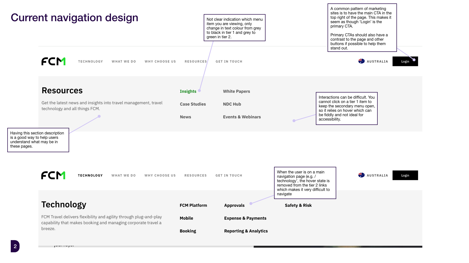
A key issue for both brands was that their websites had to cater to both prospective customers looking for information and existing customers trying to log in or contact the team. The main CTA was ‘login’, often clicked by prospective customers looking for a way to sign up, potentially losing that lead when they were unable to.
Both teams noted from customer feedback that the current items in the menus have too much crossover and it’s not clear what content each link will go to e.g. ‘What we do’ and ‘Why Choose Us’.
My initial observations
Looking at the traffic and conversion data I could see that there were well-performing pages that were missing from the main navigation and that many pages within the navigation performed poorly and could be removed to make it less bloated. Some of the highest-converting pages were blog-style content so it would be a challenge to include this in the main navigation.
FCM were using their prime navigation spot for ‘Technology’ but very few users were visiting this page, after analysing the content users may have been confused that this referred to FCM’s platform-based services.
There were some clear UI and accessibility issues to tackle across both sites.

I would begin by revising the site architecture and approving this with the team and then tackle the UI design and accessibility issues.
Architecture
Both sites have a long legacy and many pages; when looking at the Google Analytics data, outside of purely high-converting pages, it was important to note pages with strong content that kept users reading and pages that led to other high-converting pages. Of course, it was also important to take into account business requirements and where they would like customers to be guided through the top navigation.
These were multiple directions the navigation could be taken in, I presented 3-4 options to the teams, as they have the best insights into the product and customer. Based on the initial feedback these were the suggested architecture changes made to both brands, which then went through some further final revision with the teams.
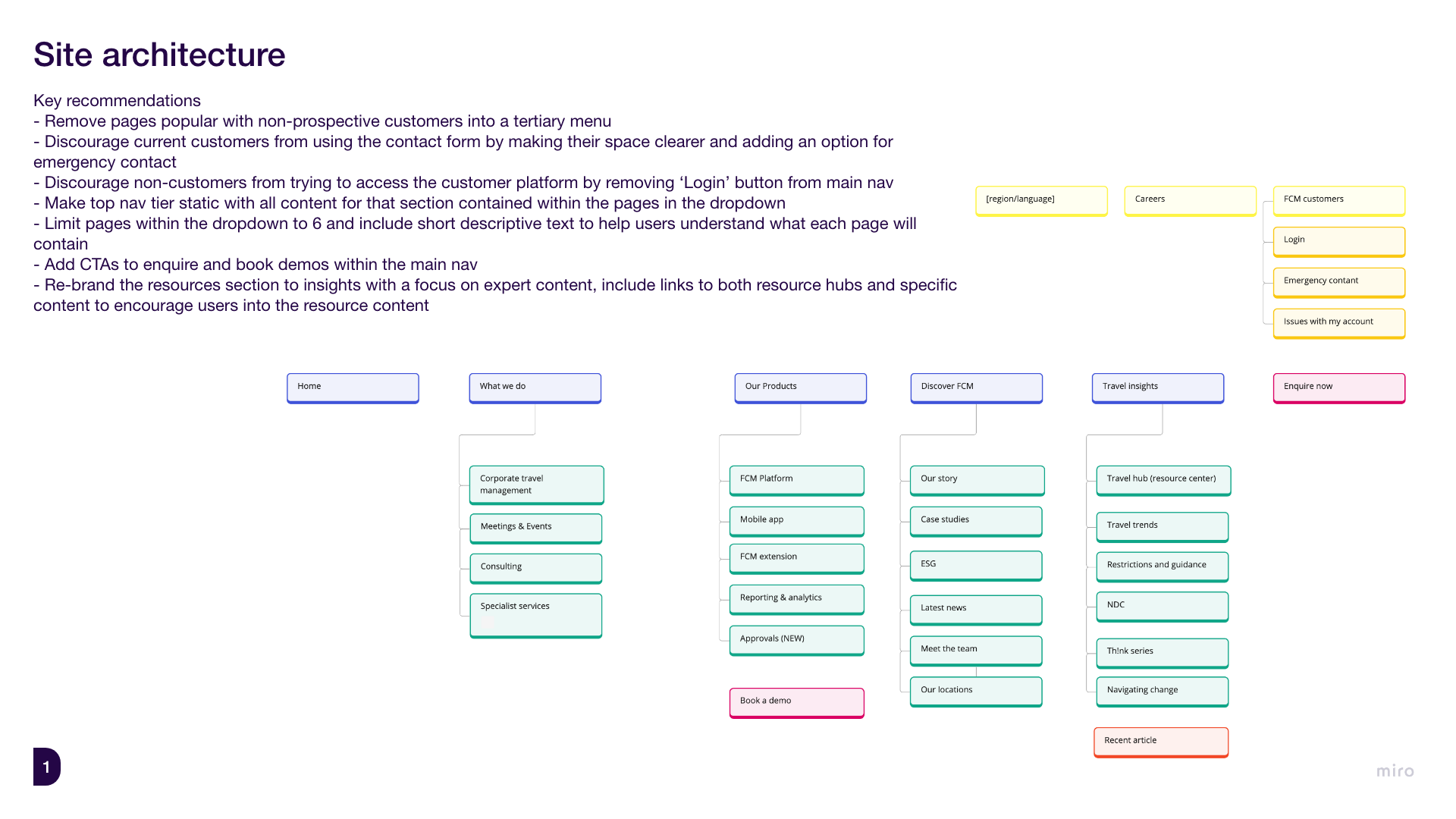
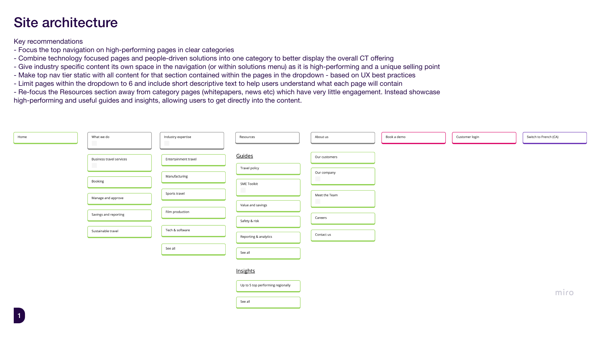
This new architecture had the best balance of pushing high-performing pages, alleviating current pain points and meeting future business goals.
UI and accessibility
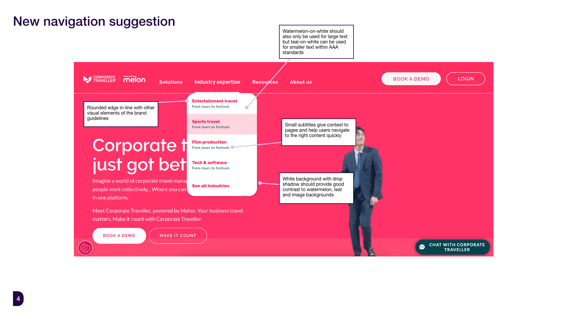
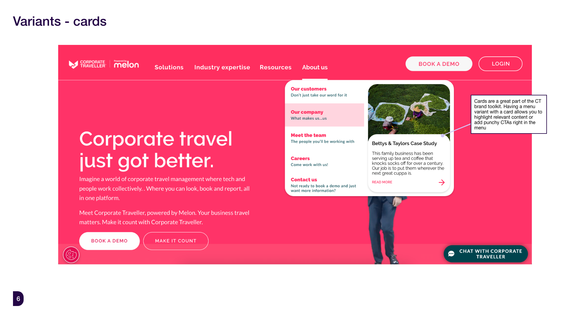
Both sites have a very strong brand identity. CT stands out amongst their competitors for their bold watermelon primary colour and use of less corporate design language, which works for their target audience of startups-SMEs. FCM targets larger corporations and their design language also reflects this, however I felt they could push their use of colour and UI components a bit further.
For FCM the suggestions focused on UX and accessibility but also improving the overall look and feel to bring more visual interest to the navigation:

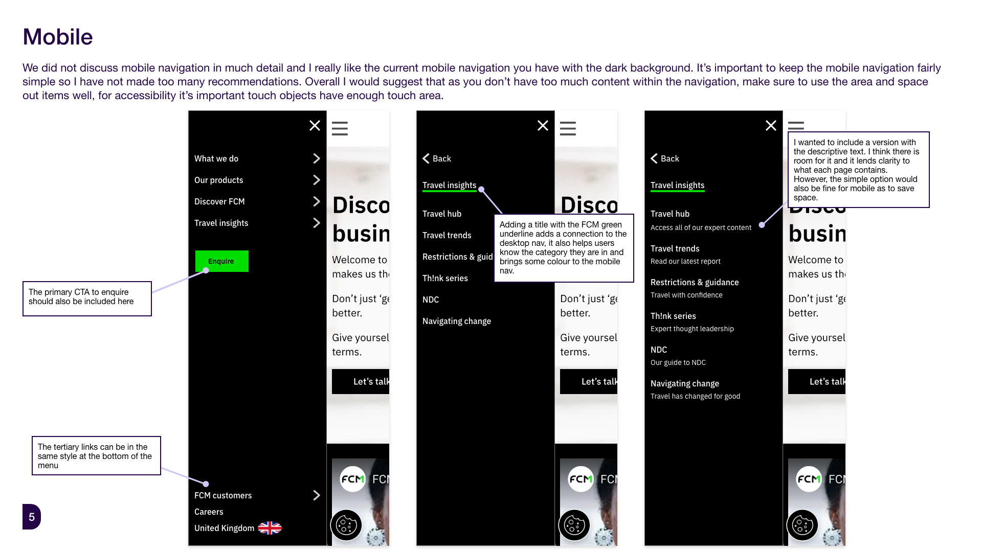
FCM is an older site that was not built responsively as traffic was primarily on desktop, however they are starting to see a shift to more mobile traffic and wanted to understand how this new navigation could look on mobile:
For CT the visual design was already quite strong so the focus was on accessibility and bringing in the architecture suggestions:
Implementation
I am pleased that both sites have implemented the suggested architecture and UI changes. It was decided that CT would also follow the design pattern suggested for FCM and create a smaller, secondary colour menu above the main navigation for users who are not prospective customers.
FCM live implementation

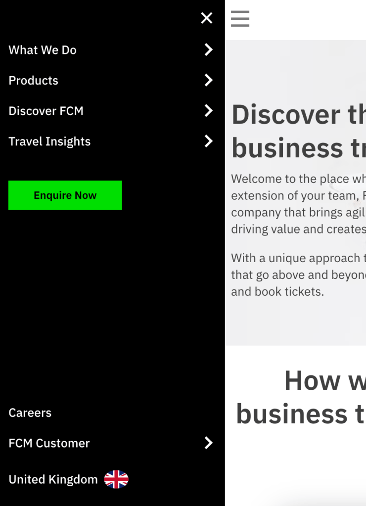
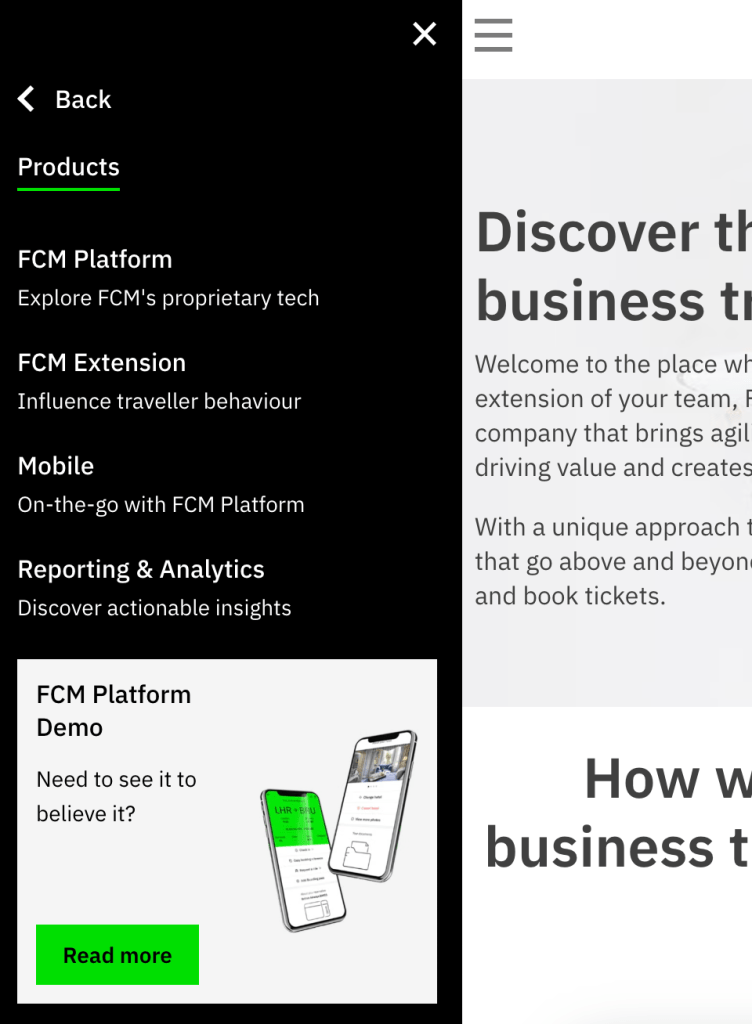
FCM mobile menu open to first and second tiers
CT live implementation

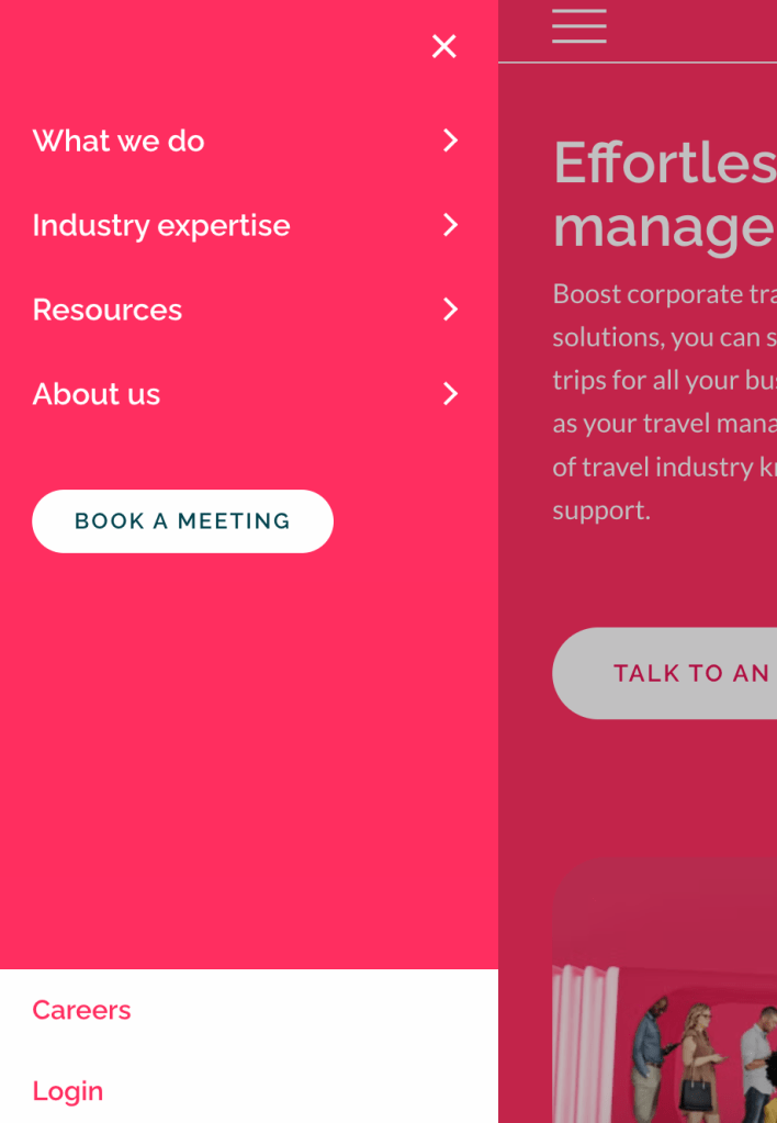

CT mobile menu open to first and second tiers
Final steps
The final steps were handing over to the development team to implement the improvements. I am then set to follow up with FCTG after 6 months to understand how the changes have impacted traffic, conversions and customer feedback and decide whether further revisions are needed.
Below is a quote from this follow-up:
Working with Bobbi on the redesign of our CT and FCM website was transformative. Her expertise in UX design and the implementation of her recommended Information Architecture and navigation resulted in significant increases in organic traffic and mobile conversion rates. Bobbi elevated our user experience, making our website much more intuitive and engaging. Highly recommended!”
– Dean Kuforiji, Head of Digital Experience at Flight Center Travel Group
If you have any questions about this case study or the process, please contact me here.
