
The Shark Trust is a registered conservation charity that raises awareness and lobbies government bodies on behalf of sharks, rays and other marine life.
A large part of what they do is “citizen science” projects. These ask ordinary members of the public (i.e not scientists) to contribute their sightings of marine life towards scientific data collection. Their main projects include sightings of shark and ray eggcases found on beaches or sightings of animals entangled in fishing nets.
For this project, I redesigned the funnel for citizen science recordings.
Role: UI Designer
Scope: 2 months
Goal: Encourage the public to record their sightings by making the process more simple and appealing
NB. This design and campaign are conceptual. I have never worked with The Shark Trust but I admire their conservation work greatly.
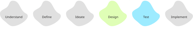
Whilst this was primarily a UI project, I wanted to approach it as a UX designer and follow a version of my UX design process (below) to ensure the user was kept in mind throughout the redesign.
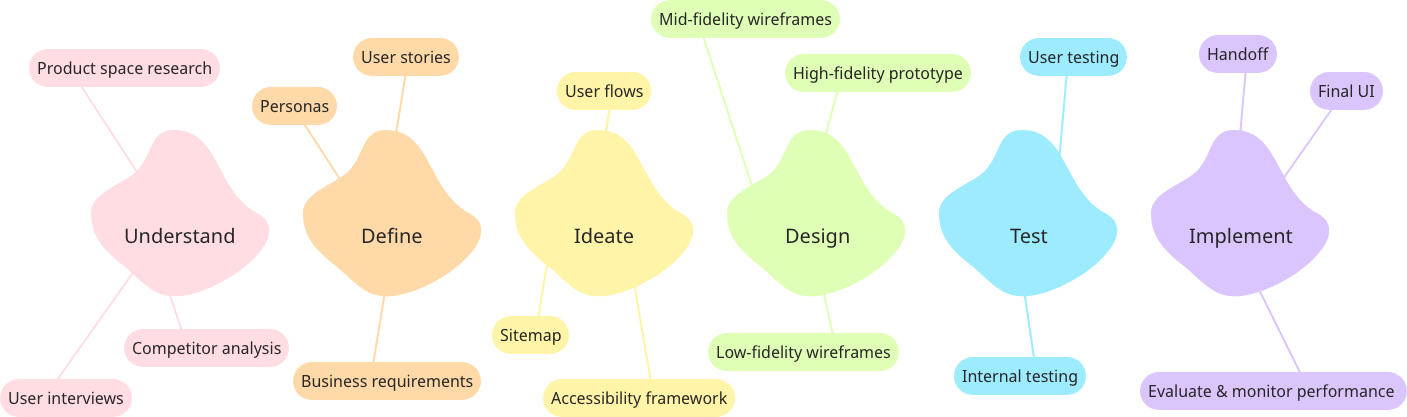
Understand
The first step was to understand the current site and user journey, as well as the focus for the redesign.
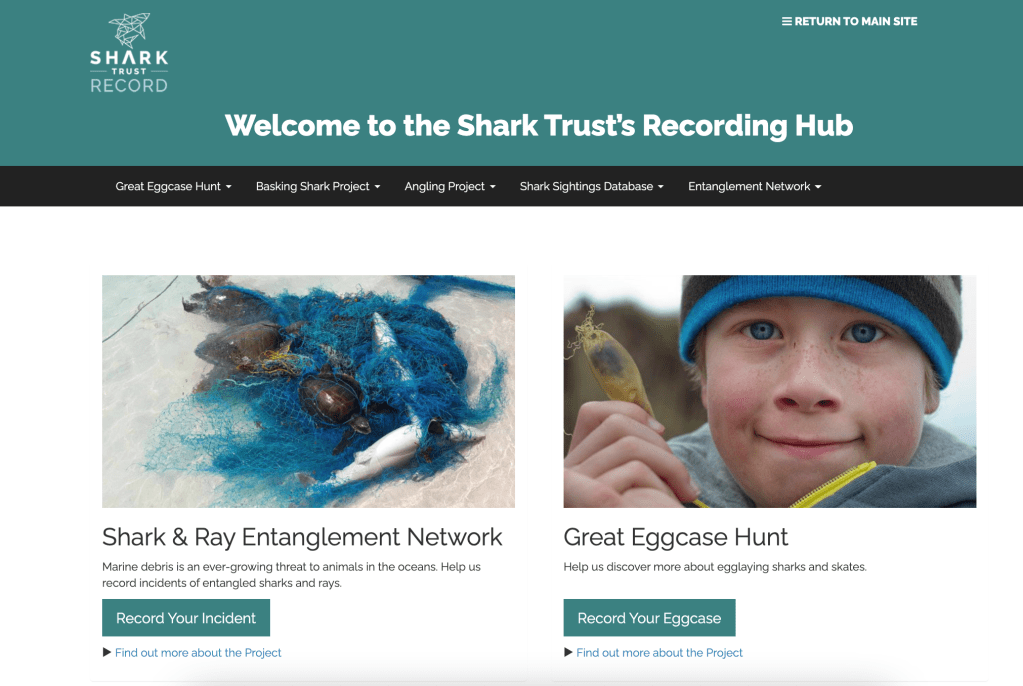

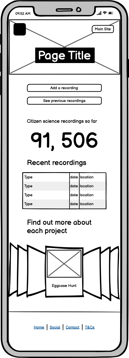
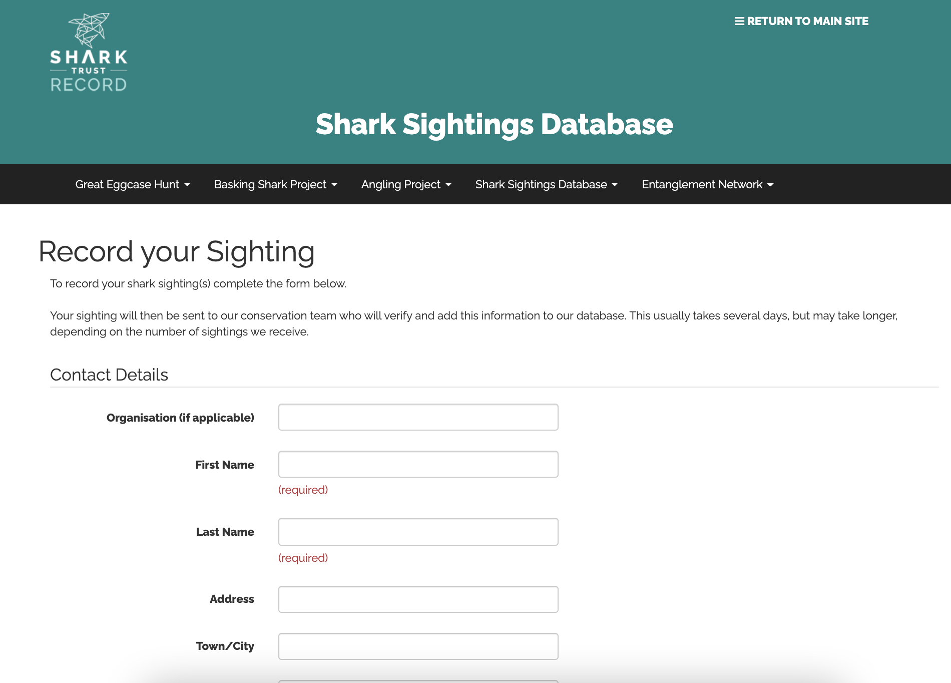
The current user journey for recording a sighting asks users to look at the different citizen science projects and decide which one their incident belongs to. They are then taken to a 1-page form to record all details about the sighting.
Redesign 5 Ws:
Who (is the product for): Anglers, students and regular citizens, who range from marine conservation enthusiasts to casual one-time visitors who want to record a recent finding.
What (is the product): The main purpose of the site is as a form submission platform, the current form can be found at https://recording.sharktrust.org/.
When (will the product be used): Generally within 24 hours of the sighting.
Where (will the product be used): At the site of the sighting (at beaches/coastlines) or at home after the sighting, could be on mobile or larger devices.
Why (am I redesigning the product): So that more data can be recorded to aid in conservation efforts.
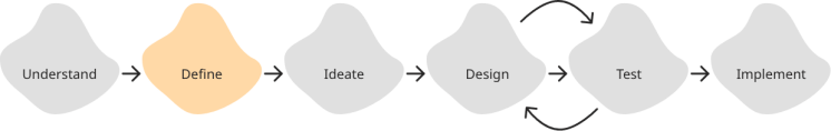
Define
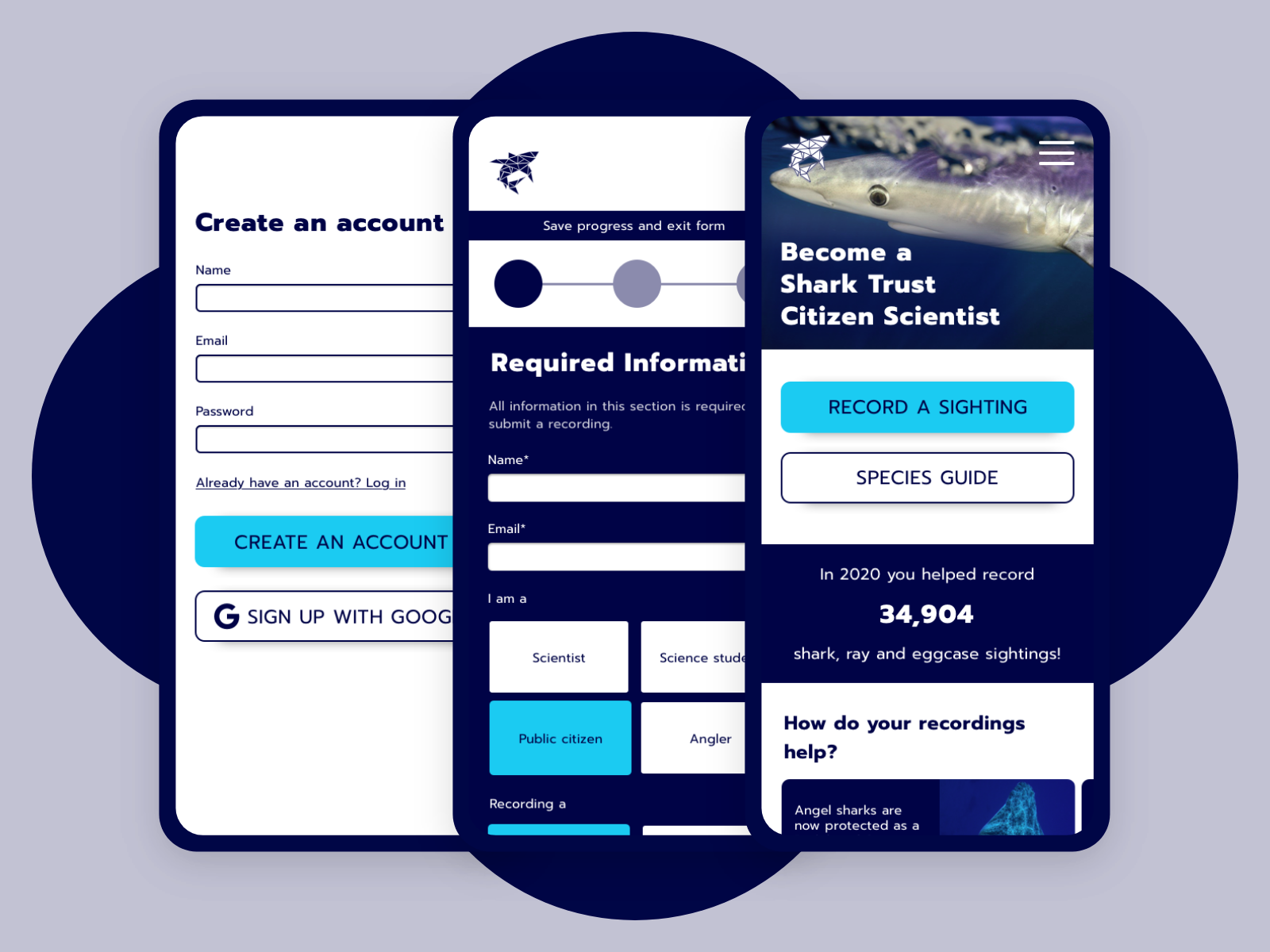
My initial hypothesis and the basis of the redesign is that it would be easier for all users to access one form that dynamically changes and submits to the correct database. This can be seen from the initial sketches.
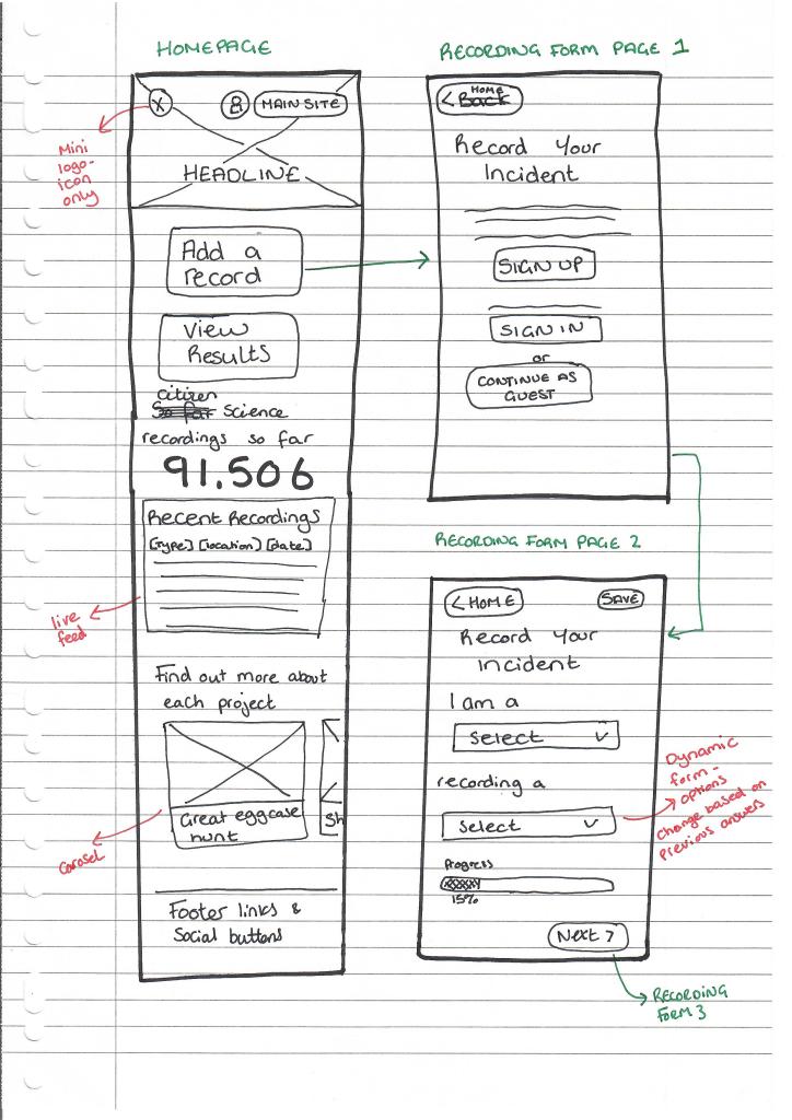

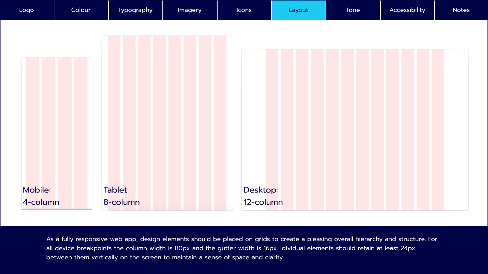
I decided to design with a mobile-first approach. Many users will be accessing the product on their mobile devices at the scene of the sighting. Designing mobile-first also helps prioritise what information is most important to the user journey.
I defined the grid system for the mobile designs at an early stage so that when I got into ideating and creating mid-fidelity wireframes there would be some structure from the start. I chose a 4-column grid for the mobile design as the elements are fairly simple so I thought 4 columns gave enough flexibility. I created larger margins on the outside of the grid to give the design a more spacious feel.

Ideate
There were many UX and UI decisions to consider during the ideation phase of this project.
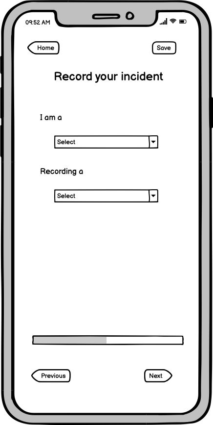
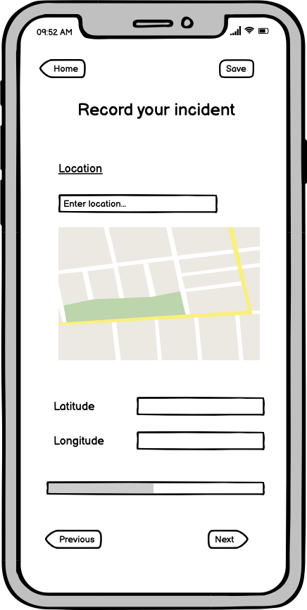
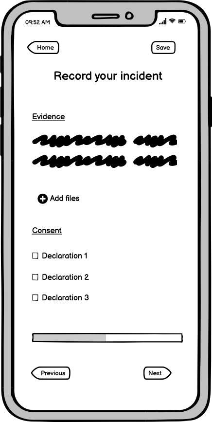
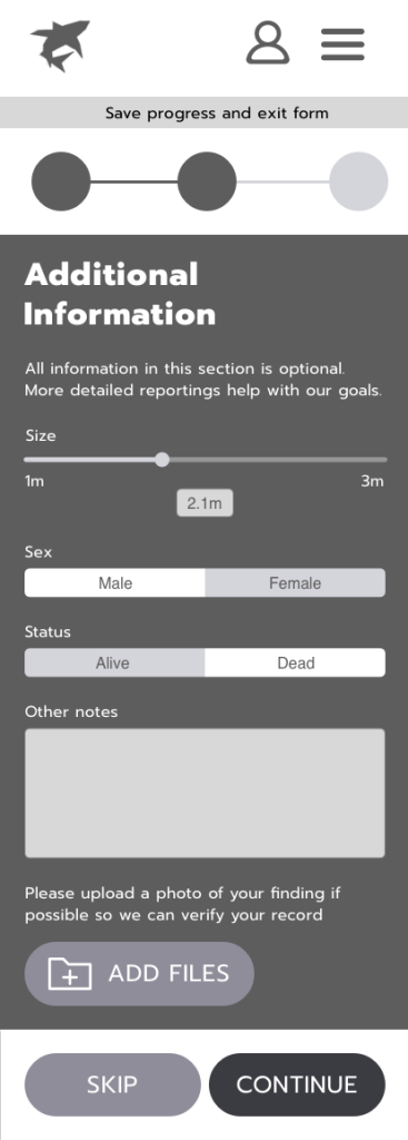
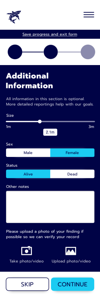
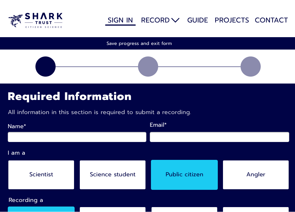
I needed to refine the user journey on the UX side and decide exactly how a user would navigate the form to submit a sighting. I decided the form should be split by “required” and “additional” information (with an option to skip the “additional” section) rather than keep the current format, which is split by topic (personal details, location details etc).
This aimed to encourage recordings as, if people only have 5 minutes, they can still contribute to the database by filling out only the “required information” without being overwhelmed with all input options.
On the UI side, this is where the visual look and feel of the project came alive, through a mood board, colour palette and imagery.

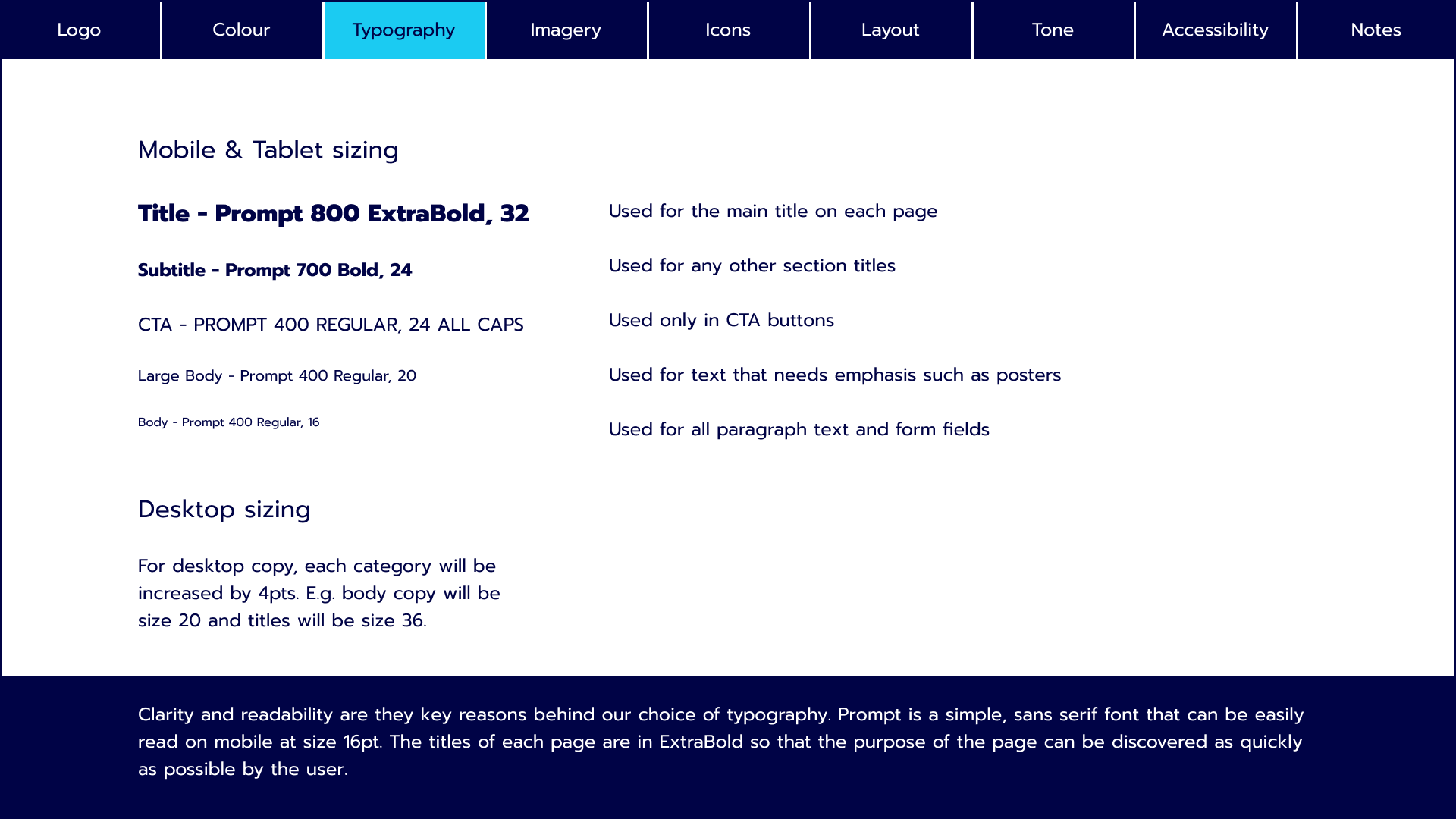
This mood board plays on the science aspect of the product whilst using modern design trends such as bold colours and high-quality, authentic photography. The typography is clear and bold to ensure readability.
The vibrant colours, simple iconography and bold typeface aim to draw people in. The tone of voice is appropriate for collecting scientific data but the copy will focus on everyday, helpful language over scientific jargon. It is an enhanced version of the current look & feel, that will hopefully improve the user experience whilst not diverging completely from the current visual identity.

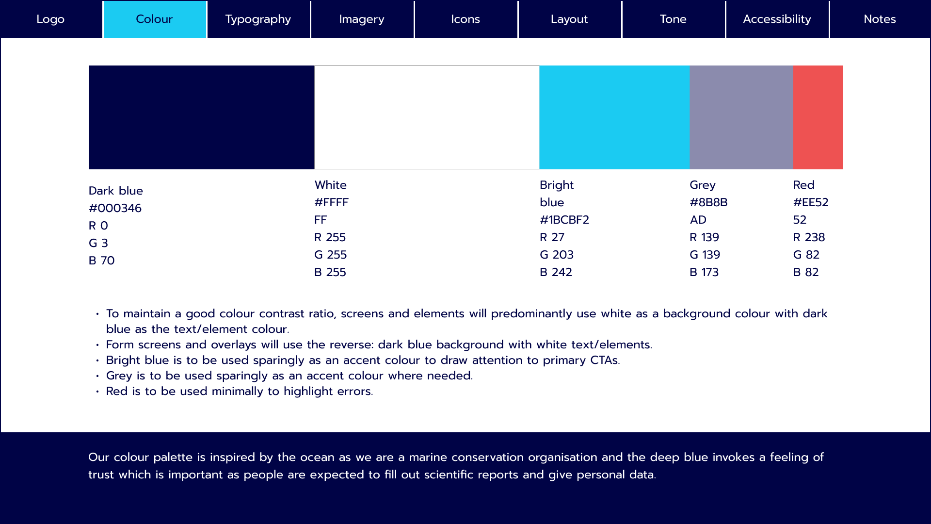
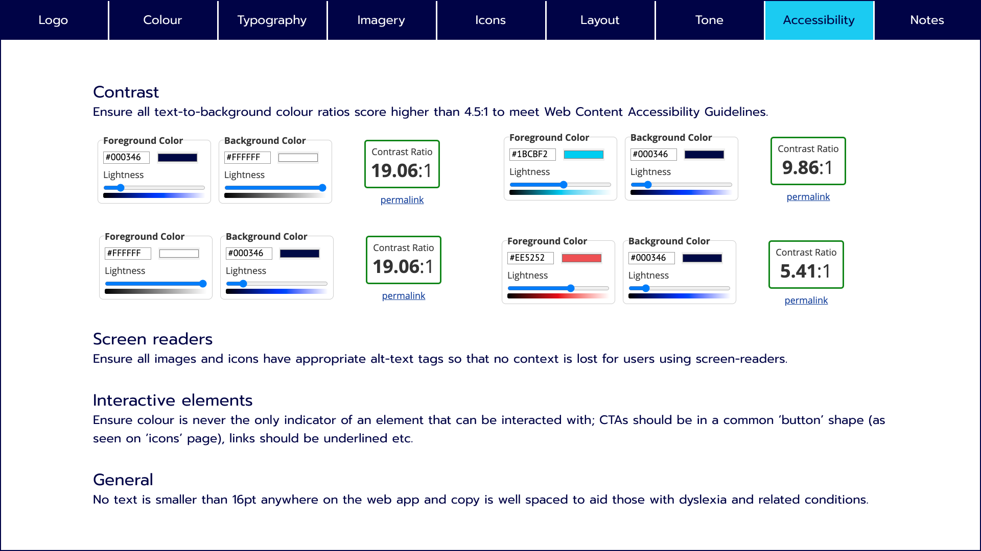
This colour palette focuses on bold blues. With a marine charity, blue is an obvious choice for both the connection to the ocean and the trustworthy emotion it evokes.
This palette was inspired by the picture of the ray in the mood board and the natural colours of the ocean. I want to draw the eye to primary CTAs with the bright blue and use the heavily contrasting red only for error messages.

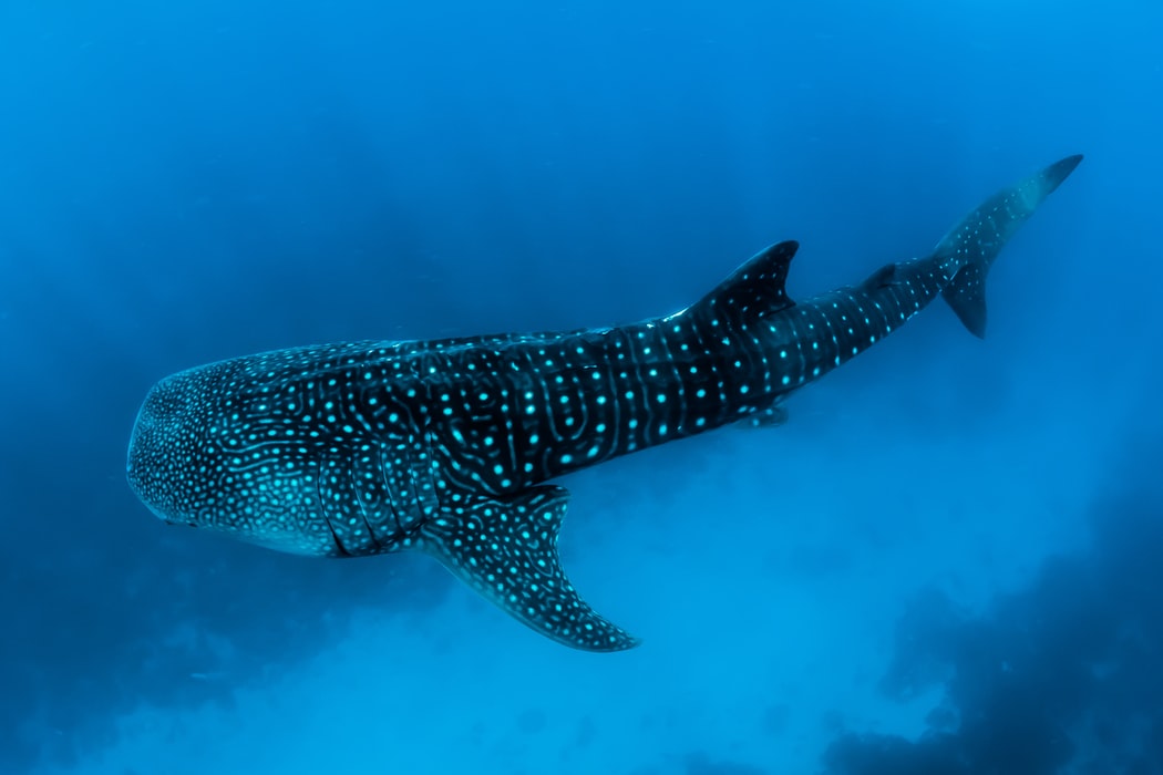
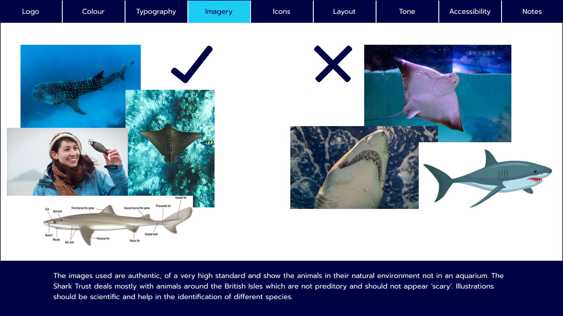
Imagery plays an important role in the visual identity of the site. As a conservation charity, people need to make a connection to the animals and the best way to invoke that is through imagery.
The above are examples of appropriate imagery for the site. High-quality, authentic photos of animals or people exploring marine environments.

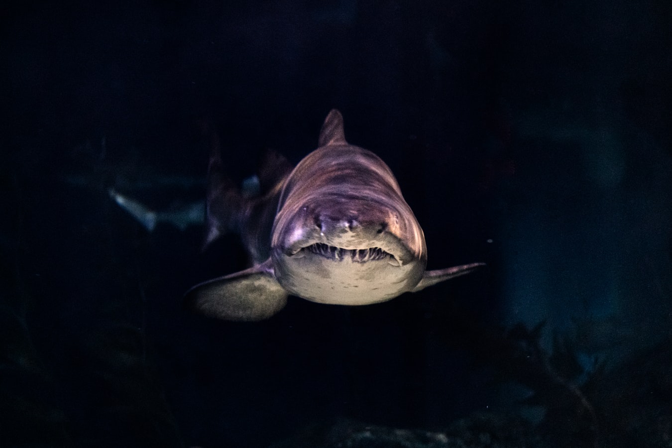
These images are less appropriate and are to be avoided. The animals should only be shown in their natural environments, not aquariums. The focus is on marine animals around the British Isles which are generally non-predatory and should not appear “scary” like this dark, menacing shot.
Design & Test
As with any product design project, the design and test phases are intertwined and cannot be completed separately.
A lot of iteration went into these designs from low to high fidelity and a lot of the key decisions can be seen in the progression of the screens below.
Low fidelity


Mid fidelity


High fidelity


Once I was happy with the overall function of the site, at the mid-fidelity point, I challenged real users to complete the task of recording a shark sighting using the interactive prototype here.
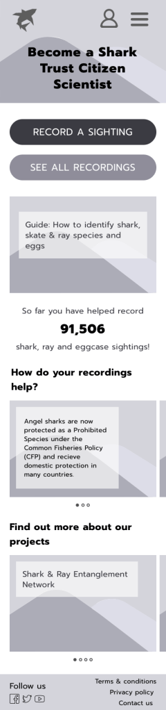
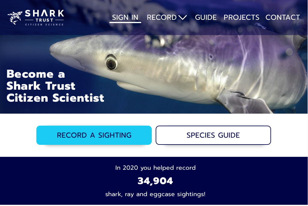
Most people were fairly comfortable making their way through the product but I also gained some valuable feedback that was implemented before taking the designs to a high-fidelity level. For example, users reported that the species guide wasn’t obvious to find and that they may want to find it earlier in the process, so I made it the secondary CTA on the home page.

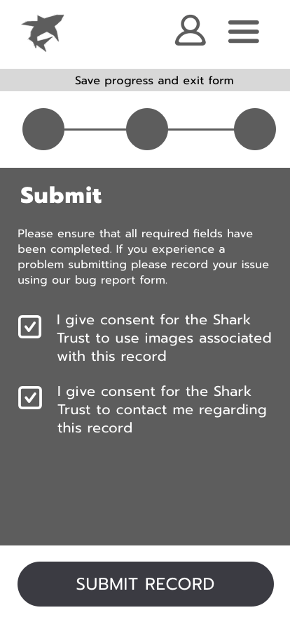
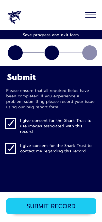
It’s very important users don’t click away when submitting their record as it may not make it to the database, so the fun loading animation above will play to keep them occupied for the few seconds it takes to submit.
As the process of filling out a form can be quite monotonous, I tried to keep users engaged through small gestures and animations, for example, using energetic screen transitions that bring the focus back to the new page.
Implement


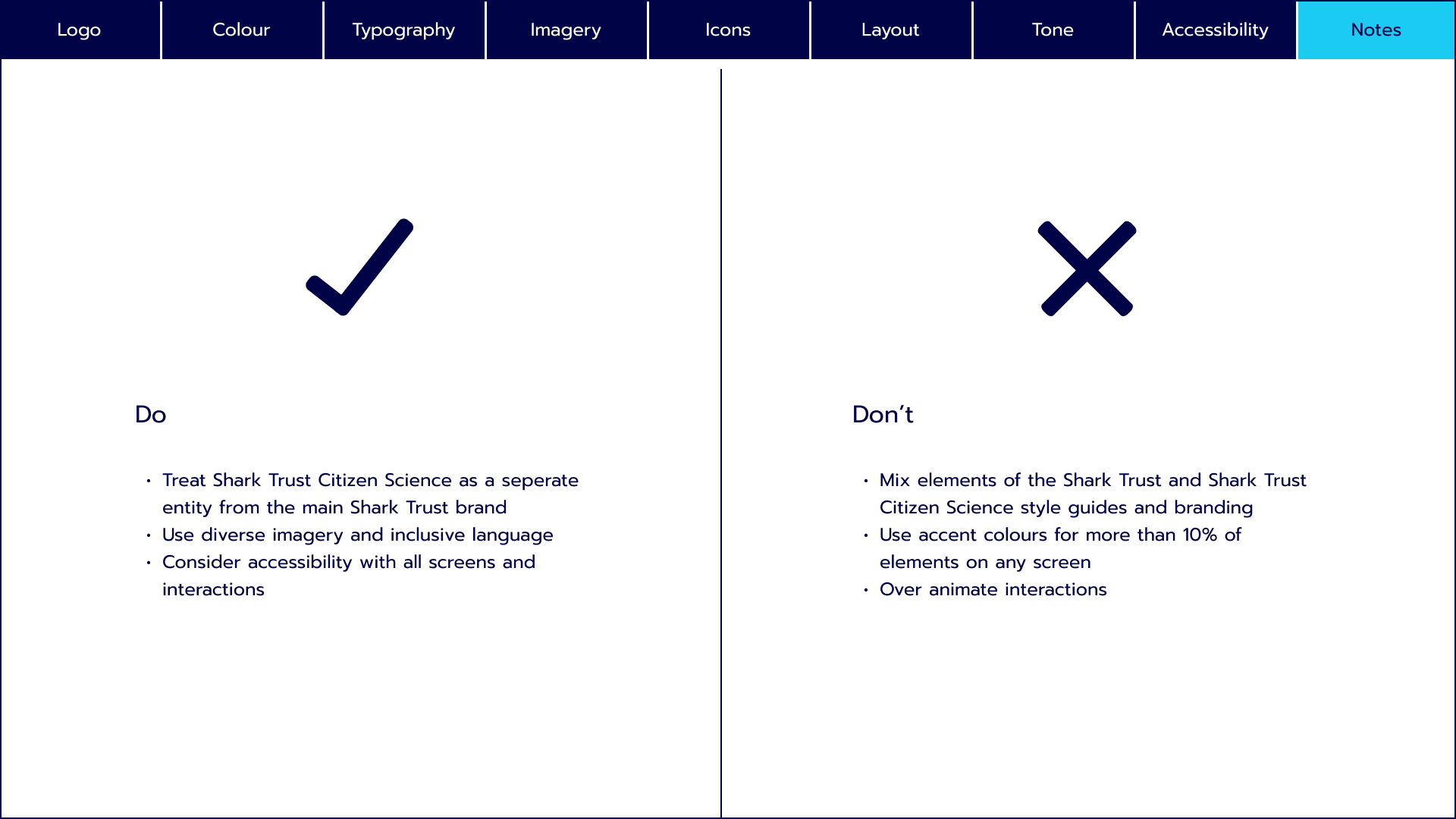
I created a style guide to ensure consistency across the site and branding. As with the current website, the Shark Trust Citizen Science brand is adjacent to the main Shark Trust brand. This style guide aims to honour that and create a set of guidelines strictly for this section of the brand.
Until this point, the focus had been fully on the mobile designs so I had to ensure that the responsive design for the larger breakpoints for tablet and desktop devices had the same flow and symmetry as the mobile breakpoint.

Before and after comparisons

Next steps & learnings
The next steps on this project would be working with a developer to map out the dynamic approach to the form.
From a UI perspective, I would next like to refine incorrect inputs on form fields to make the feedback to the user as useful as possible.
Completing this project, I learnt a lot personally about the UI process, especially how important early research, such as mood boards, are for influencing your design decisions.
I also really improved my approach to responsive designs and ensuring that all breakpoints are consistent.
