Vocabulove is a native iOS app that helps people discover, learn and retain foreign language vocabulary related to their interests.
The project was created as part of Career Foundry’s immersive UX program.
An overview of this case study can also be viewed as a video here https://youtu.be/eLiVnuKFKZA
Project brief: To design and test a prototype for a native app that will help people learn and retain vocabulary
Role: UX Designer, UI Designer, UX Researcher, Product Owner
Tools: Figma, Marvel POP
Timescale: 4 weeks
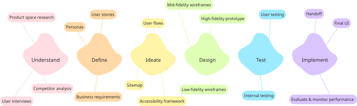
My design process:
Problem statement: How might we design a mobile app that empowers people to learn new vocabulary?
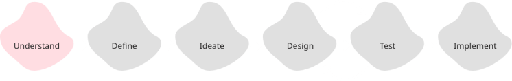
Understand
To begin to find solutions for the problem statement, I first needed to understand the problem space. I analysed some popular vocabulary learning apps to understand what was currently on the market. In particular, I resonated with the simplicity of Chegg Prep and the way Vocabulary helped users to discover new words.

To get a better understanding of how this app would be used, I spoke to users who are actively learning or interested in learning new vocabulary to find out how it fits into their daily routine, any difficulties that they have and what tools they currently use.

Some valuable core insights I gained from these initial user interviews include:
- People said they were more engaged if they cared about the topic of the vocabulary. A pain point raised was that other apps teach words they’ll never use to engage with their specific friends/media
- Retention was mentioned to be more difficult than learning. Interviewees said they need repetition and that words were better retained if they could relate them to something visual or memorable
After analysing the space and speaking to users, I had the initial idea to focus on a companion app to traditional learning or app-based study (such as Duolingo), by creating a more personalised flashcard experience for discovering and practising relevant vocabulary.
Define

To ensure that I kept the user in mind in all design decisions moving forwards I developed a proto-persona, called Emma. Emma represents the main behaviours, needs, goals and characteristics of the primary audience, based on initial user research.

From the initial research, I developed some early user stories to guide the flow and features of the app, from Emma’s point of view. E.g:
- I want to be able to add new vocabulary quickly and include images or sound so that I can add words I discover organically when with French friends or watching TV in French.
- I want to personalise my learning experience so that I am only shown vocabulary that I have added or have indicated is relevant to my interests.
- I want to be able to repeat vocabulary revision often so that I retain the vocabulary long-term.
At this point, to begin ideating solutions, taking all previous research and assumptions into account, I developed the initial problem statement further.
Emma needs a way to learn and retain new French vocabulary that she will use in her day-to-day life because she wants to better engage with her French friends and French culture online. We will know this to be true when we see that she can view and review vocabulary based on topics she has marked as relevant to her interests.
The working hypothesis to test solutions against became:
I believe that by creating a vocabulary learning platform that allows content to be curated to whatever topics the user is interested in, we will achieve over 60% retention of new words learnt by Emma.
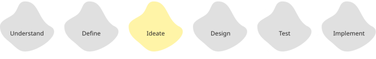
Ideate
After defining who will use the app and what their main goals would be, I began mapping out key user flows to shape the app. Whilst there were many features and interactions that I wanted to include to create a great app, I had to narrow it down to the most important to design a practical MVP (minimum viable product) to test.
Based on the goals of Emma, the 2 main flows to consider were;
- Being able to add her own vocabulary to the app
- Curating the content to her interests
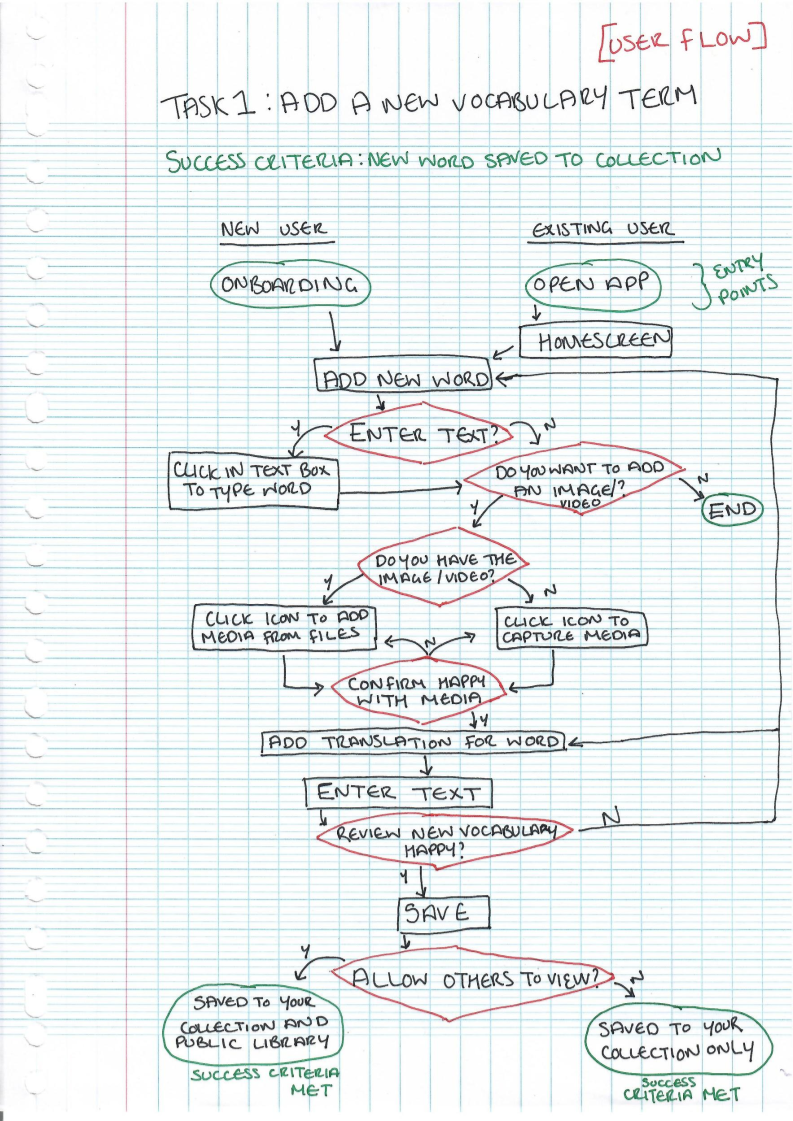

Drawing out these flows helped me further understand the basic information architecture before moving into wireframes. For example, knowing I would need the ‘add’ button to be accessible from the homepage and that the personal preferences would be dealt with during onboarding so they could thereafter be kept in the settings, as they will be edited infrequently.
Design & Test
I am combining these sections as they work in tandem and I don’t think you can detail one without the other.
Using the user flows as a guide for what screens needed to be created, and using the competitor analysis/best practice I had observed from other apps as inspiration, I sketched out the initial wireframes on paper.
Below is an example of some of the initial rough sketch and low-fidelity wireframes:

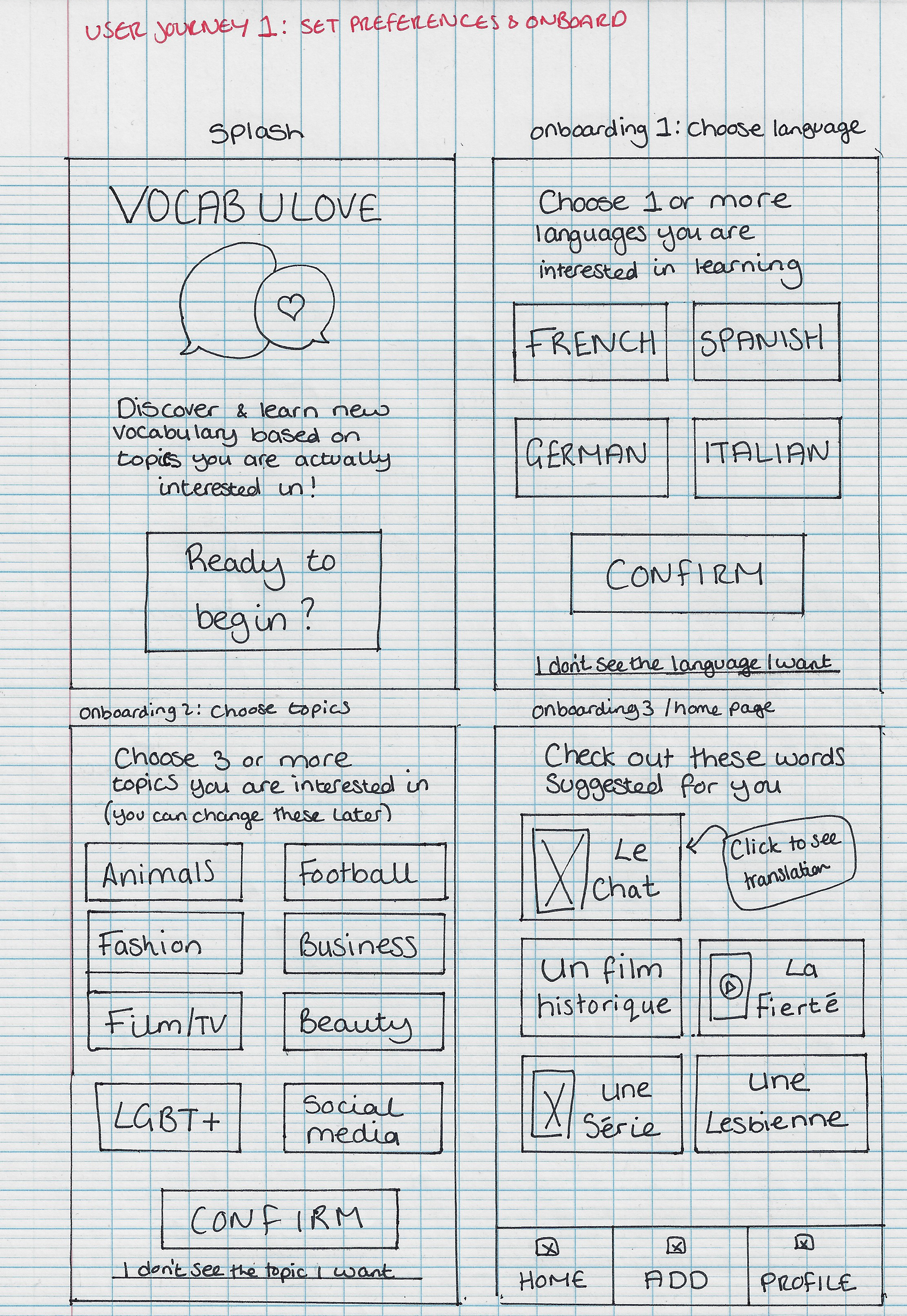


After a few rounds of iteration from peers and mentors, I wanted to test the designs out at this early point with real users so I could find any errors to fix before moving onto a higher fidelity design.
I used Marvel Pop to turn my hand-drawn sketches into a clickable prototype. This style of testing worked well for this project as the wireframes and flow are fairly simple and the design patterns are quite recognisable even in sketched format.
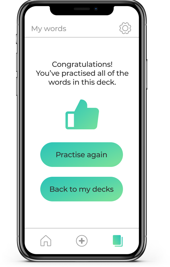
As per the user flows, the tests focused on onboarding functionality and adding new vocabulary. They were carried out as a combination of moderated in-person and remote, 10 minute, task-based user tests.
The tasks were given in small scenarios, as follows:
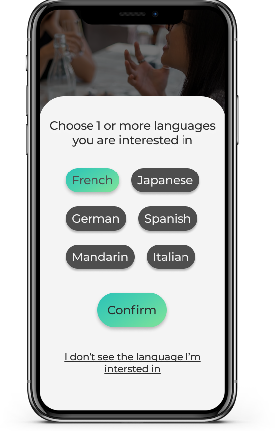
- You want to discover and learn vocabulary in French around animals, LGBT+ and film/TV. After downloading the Vocabulove app you open it and set these preferences.
- After setting your preferences, you want to explore the app by viewing a word and adding it to your favourites.
- You want to create an account so that you can save your preferences and favourite words.
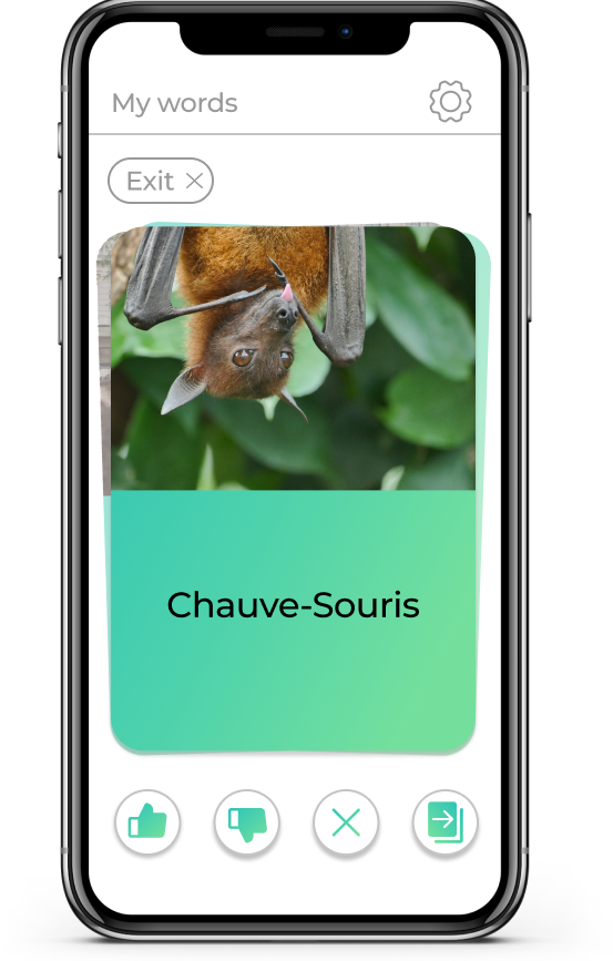
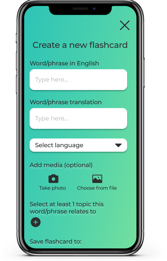
- You have just learnt the word ‘Le Cinéma’ from your French friend and want to add it to your library to practice it, with an image to make it more memorable.
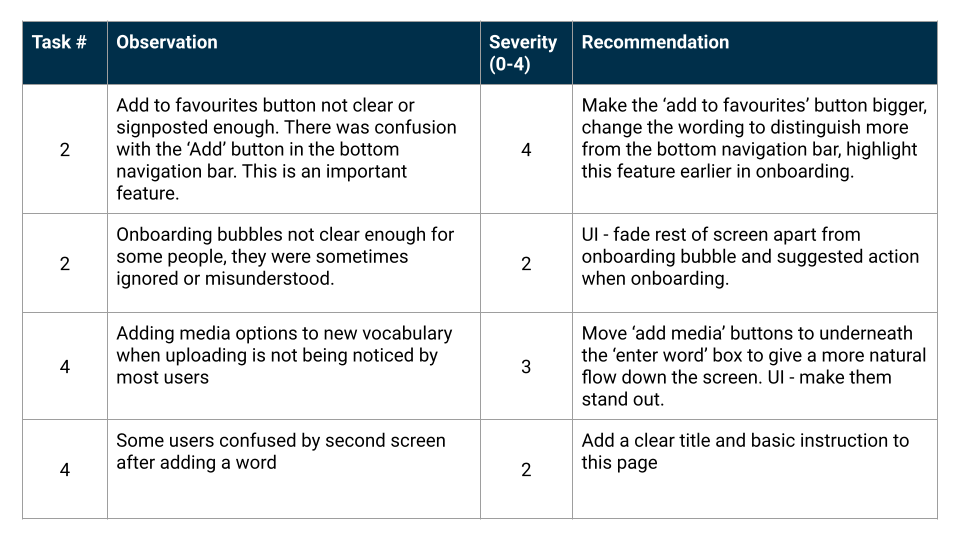
The tests flagged up some really interesting errors. In particular, users were overwhelmed when adding a new word. Originally the design was more visual, prompting users to fill in the front and back of the card and then the options for tagging and saving were presented after. From observing users, I decided it would be better to have this feature work more like a form where users simply input all information needed on the card and what tags to associate it with and the app generates the card when the form is submitted.
I also noted that tooltips were often ignored, but the UI had plenty of space to utilise more clear, written commands that negated the need for the tooltips.
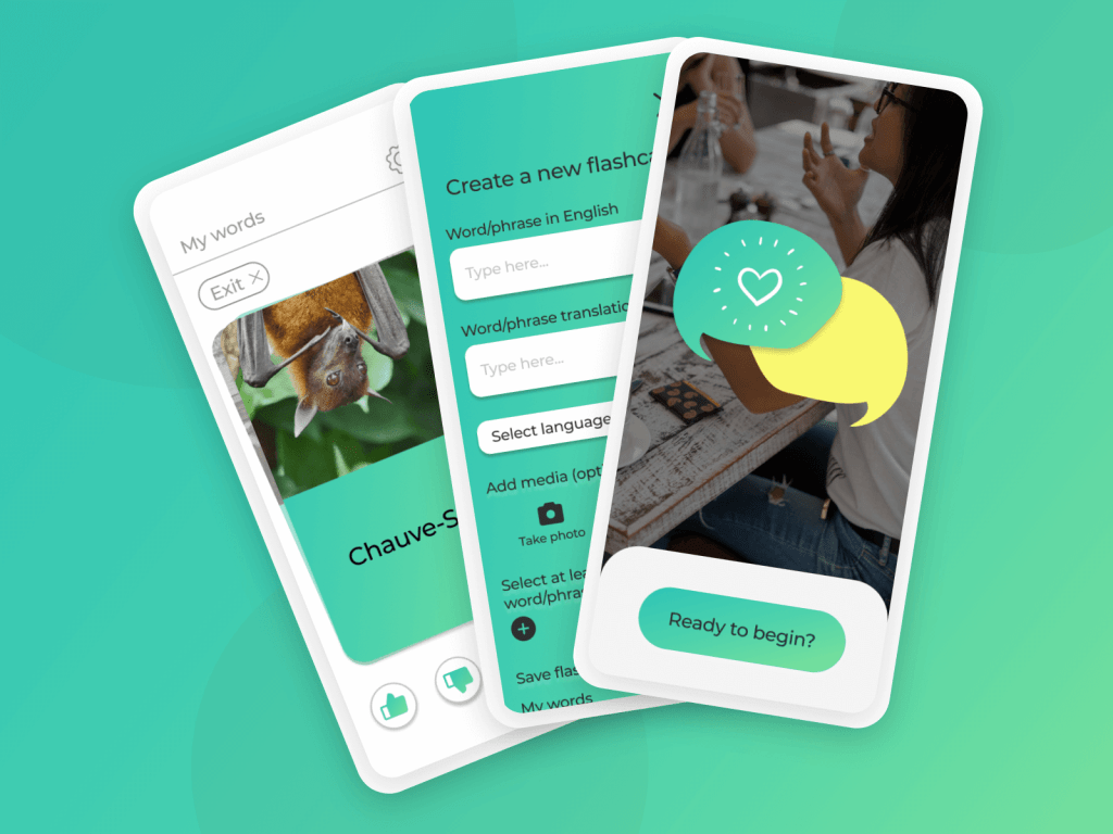
All of the errors flagged, plus additional research into best practice design patterns lead to the creation of these high-fidelity wireframes. I believe these wireframes show a much clearer flow whilst maintaining the simplicity of the original designs that allowed users to achieve their goals quickly.
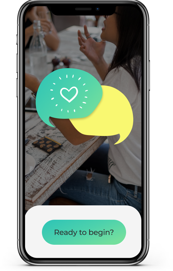
I’ve included 2 versions of the mockups to illustrate the visual evolution of the UI after iterating based on feedback and best practise.
First version
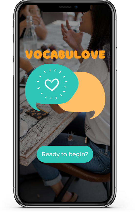


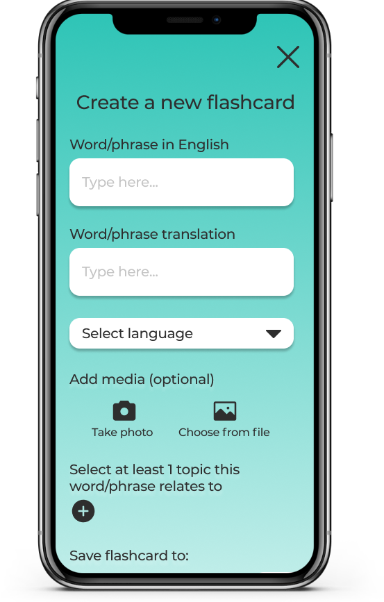


Final version


An interactive prototype can be viewed here: https://www.figma.com/proto/T5lUSs9hwheq4UZi2jy1bU/Vocabulove?node-id=0%3A3&scaling=scale-down
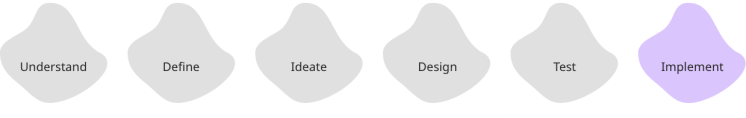
Implement
As this was a 4-week academic project, the app was only required to be developed to the low-fidelity stage and therefore wasn’t fully developed and tested to the standards that would be needed to launch the app. Although I did proceed to create the high-fidelity as a personal challenge to see how I could bring the app to life.
In a real-world scenario, the next steps that I would take towards the app being built would be;
- Map out other core user flows, creating and testing new wireframes
- Develop the ‘practice’ side of the app further, including audio functionality to practice pronunciation
- Gamify actions to incentivise frequent return and as a potential monetisation stream
- Test vocabulary retention against our hypothesised target of 60%
Personal learnings
As this was my first time doing traditional user testing, I learnt a lot about wording questions in a non-leading way and ensuring that I choose a diverse range of participants.
I now better understand the importance of sketching and how most user issues can be found from simple, sketched prototypes before time and money are wasted on developing high-fidelity, untested wireframes.
Specific technical notes from this project that I will take into others moving forwards:
- Ensure actions during onboarding are signposted VERY clearly
- Ensure wordings of different actions on the same page are distinct
- Ensure pages have titles and instruction without assuming the intent is clear
- Icons, CTAs and buttons need to be placed in the most natural path for users
- Ensure prototypes are as connected as possible regardless of testing tasks
Finally, I found it very interesting to note that when creating an app for a target audience that is very curious by nature, I should be aware that they may not take the most obvious paths when testing. The behaviour of the target audience should be held in mind when designing tests as well as products.

Leave a comment