
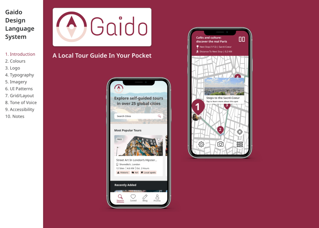
Gaido is a responsive web app that combines the interactivity and fun of a scavenger hunt game with the exploration and discovery of travelling, through self-guided city tours.
Project brief: To create a ‘scavenger hunt’ responsive web app as the principle project of Career Foundry’s immersive UX program
Role: UX Designer, UI Designer, UX Researcher, Product Owner
Tools: Adobe XD, Figma, OptimalSort
Scope: 5 months
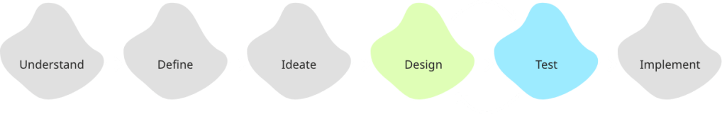
My design process:
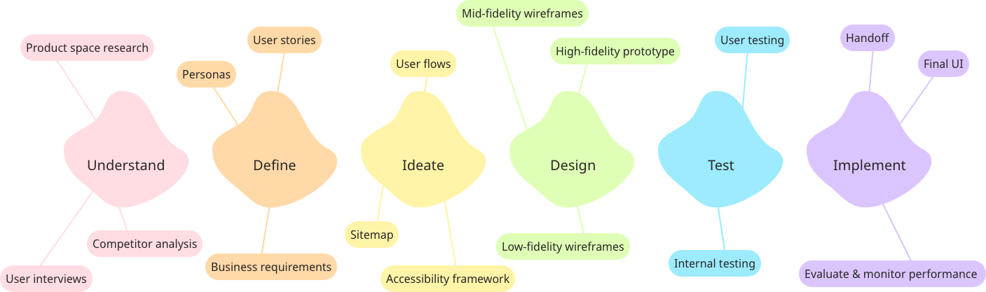
Problem statement: How can we combine the gamification of scavenger hunts with the discovery of travel to allow people to explore destinations in an immersive way?
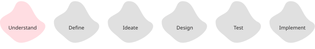
Understand
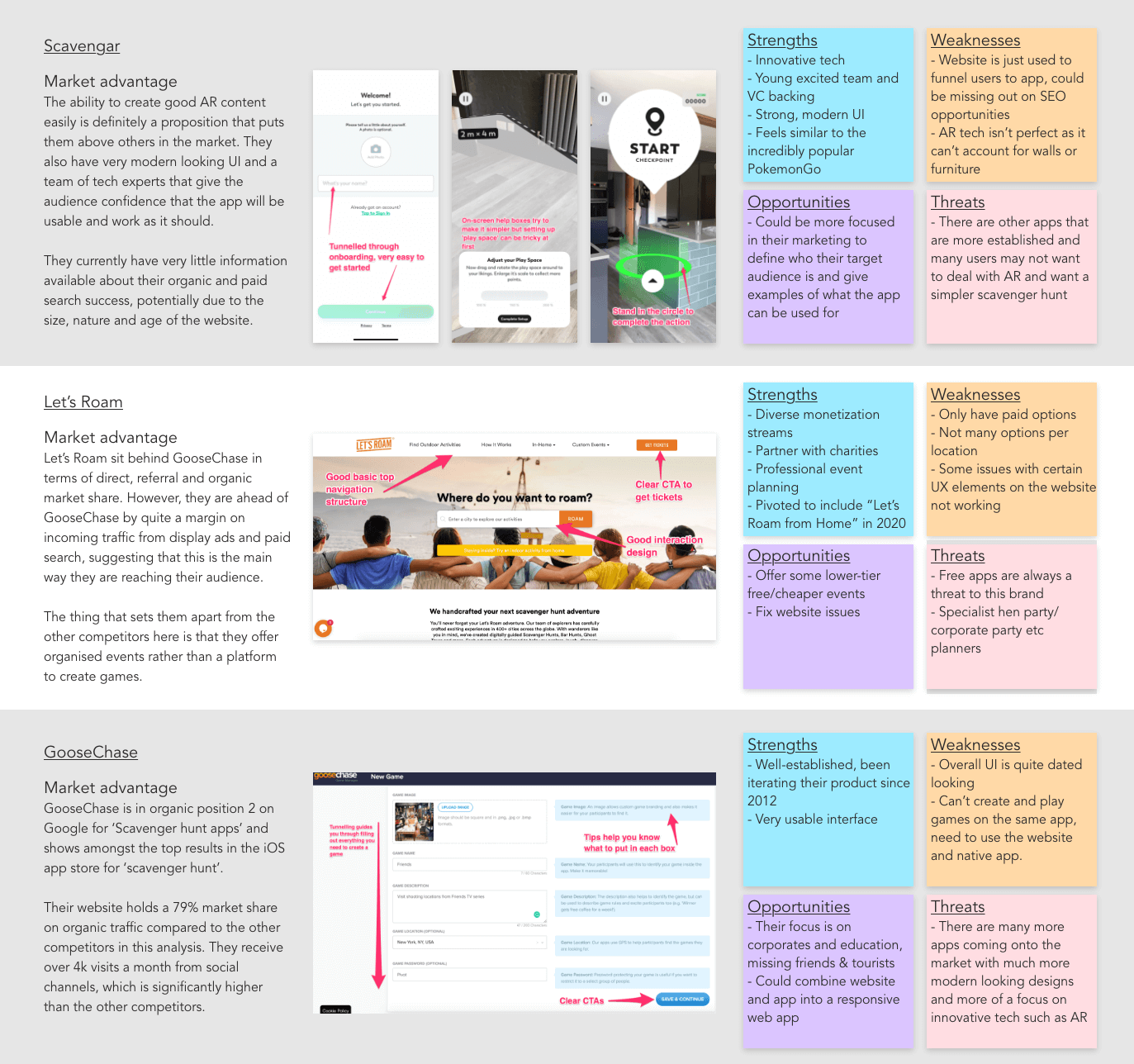
I started by trying to understand the product space through competitor research and analysis. An overview of my findings can be found below but one thing that stood out to me was that most of these apps were more about finding objects/completing the objectives of the game than exploring where you are.
Looking then to travel apps that are about exploring a new place, I saw that there were travel guides but nothing that takes you from place to place and helps you travel in an immersive way.
This gap in the market combined with a personal passion for travel led me to use this project to tackle the following problem:
How can we combine the gamification of scavenger hunts with the discovery of travel to allow people to explore destinations in an immersive way?
Now that I had my theory, I ran user interviews and a survey to understand if and how this product would be used by people who like to travel.
After many rounds of analysis and affinity mapping, some great insights came out of this initial user research.

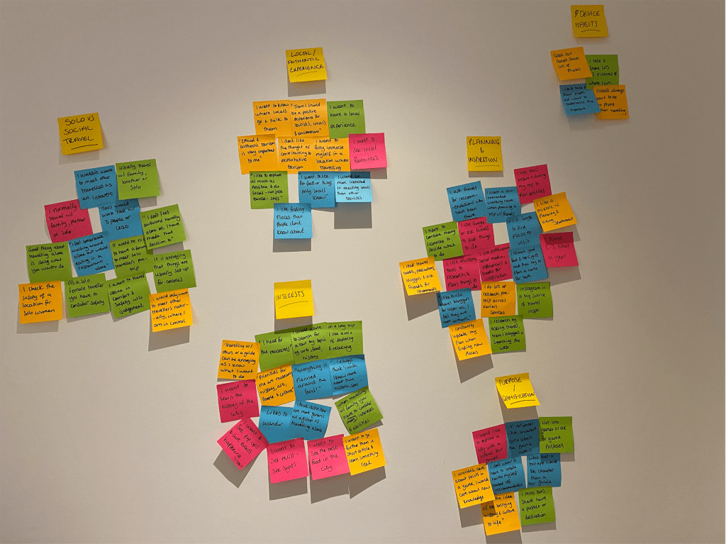
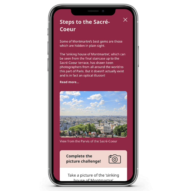
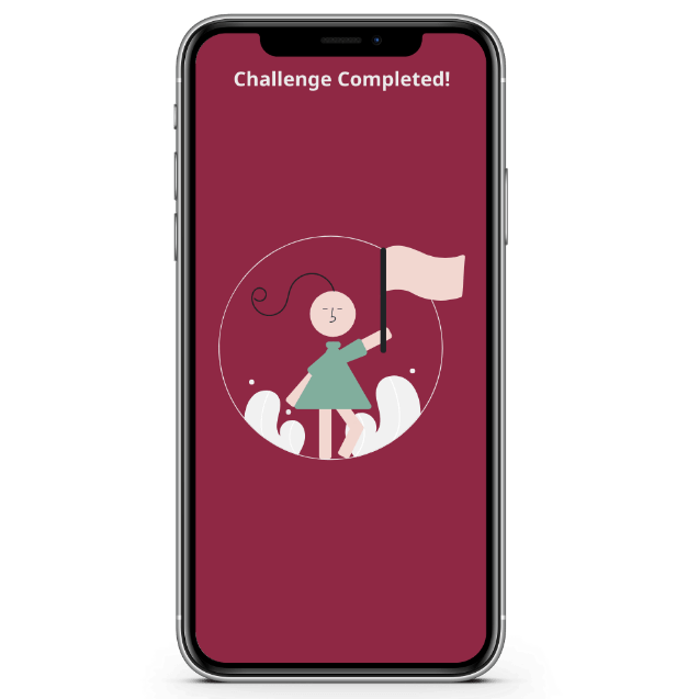
For example, I noted that those who care about travel aren’t interested in the gamified elements of keeping score, they are interested in ‘unlocking’ knowledge. This led to a key design decision for the app – to include gamified elements to keep people coming back but in a much more subtle way.
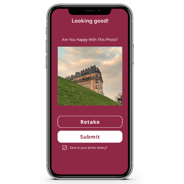
i.e. there are no points or scores, users unlock knowledge at each location with challenges that immerse them in the location.
Define
Furthering on from the user research, I started expanding on who specifically would use this app by developing a primary persona;
Meet Ines!
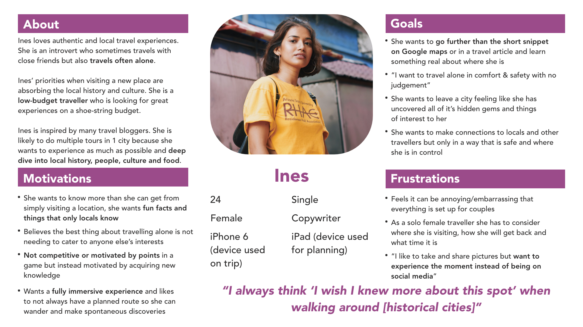
Ines became the backbone of the project and future decisions were primarily made with her in mind.
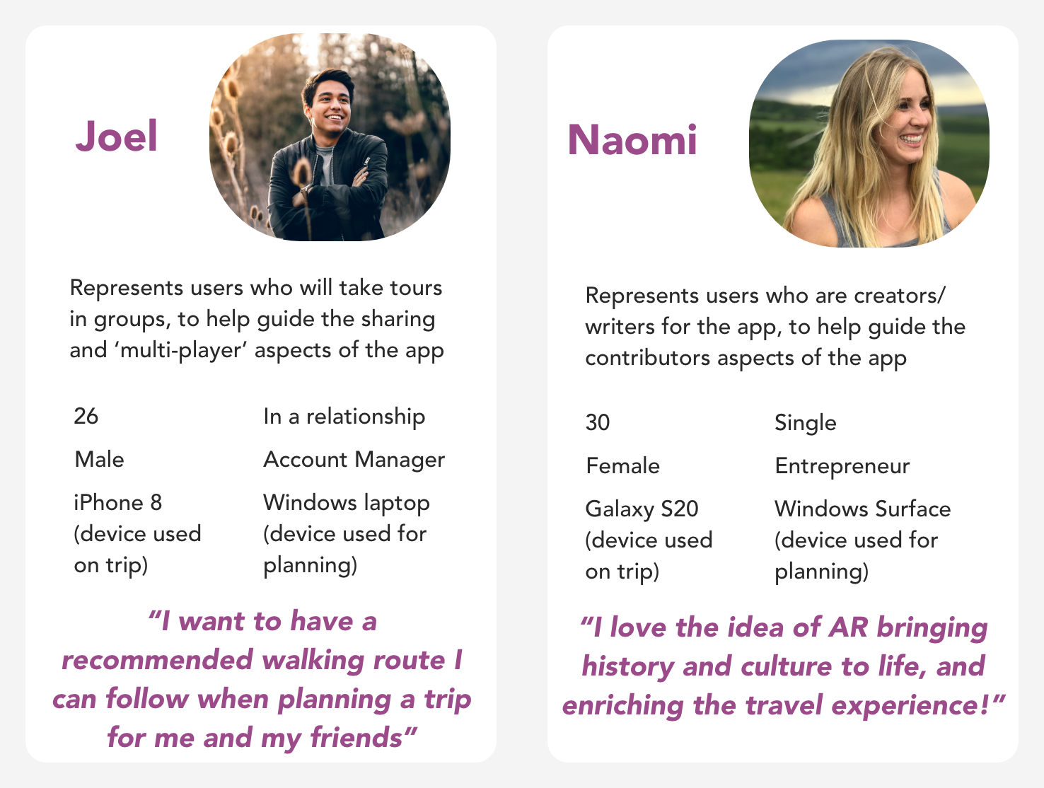
Whilst Ines represented the majority of my users, I knew there were some other important user groups to consider in design decisions. So, I developed two secondary personas to represent these groups in the decision making process.
Knowing now who would be using the app, I started to consider how they were most likely to use it. Developing broad user stories at this point was a great way to start thinking about what features would be necessary for an MVP and helped guide the core user flows.
Examples of early user stories:
- As a user, I want to see my location in relation to the entire hunt so that I can work out how to reach the next object
- (Enable GPS tracking to guide users through hunts)
- As a user, I want to be able to complete hunts offline so that I don’t need to be connected to WiFi whilst moving around the city or use all my data in a foreign country
- (Enable hunts to be downloaded and completed if the device is offline)
- As a user, I want to search for tours by location name or GPS so that I am only shown hunts local to where I am or where I know I am going
- As a creator, I want to be able to geotag my tours so that they appear to the most relevant users
- (Ability to tag and search tours by location)
Even though this was an academic project, it was important for me to consider the business requirements as if it were a real-world project as these can have a huge effect on the design. I decided that a combination of affiliate in-app purchases and some premium paid tours would be the best way to monetise, whilst still allowing the app and most tours to be free, as the primary user group are budget travellers.
Ideate
Knowing now who will use the product and how, I started mapping out specific pages and flows to shape the app. I had many ideas so had to prioritise flows based on the needs of my primary persona to create a functional MVP.
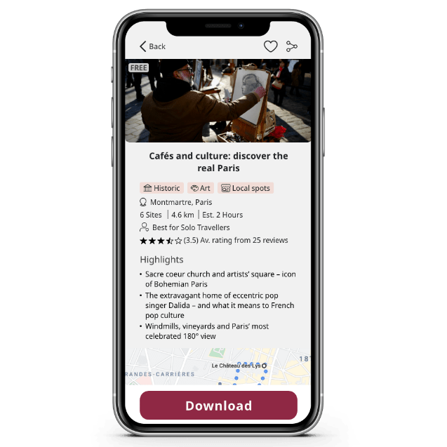
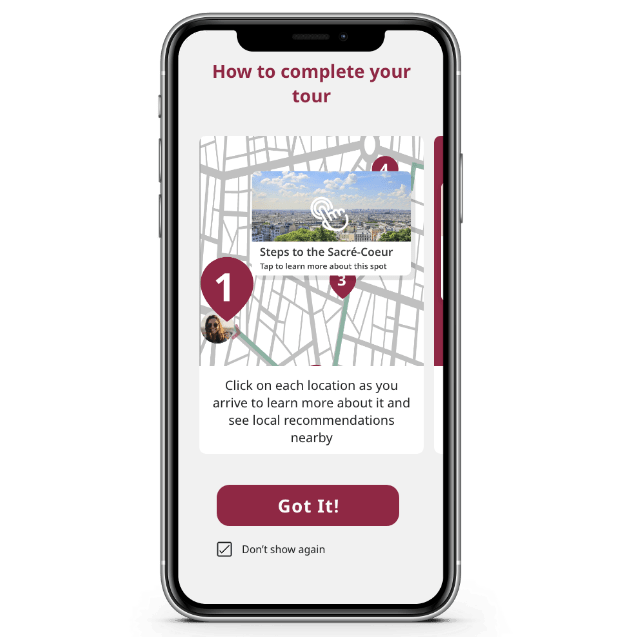
The core user flows are therefore linked to the main goals set out in the user stories and primary persona; the ability to search for, download and complete a tour.


Using the core user flows as a starting point I mapped out the entire app in a sitemap to work out what kind of navigation options I would need.
Iterating on the sitemap using peer feedback I managed to strip it back to only needing 4 menu items in a bottom navigation bar that would be visible throughout the app rather than a hidden burger menu. This was a key design decision for the app’s usability.
At this early stage, it was important for me to think about accessibility before even sketching out the designs. I made a checklist based on WCAG and decided how I could incorporate accessible features throughout the design and test process.
Design & Test
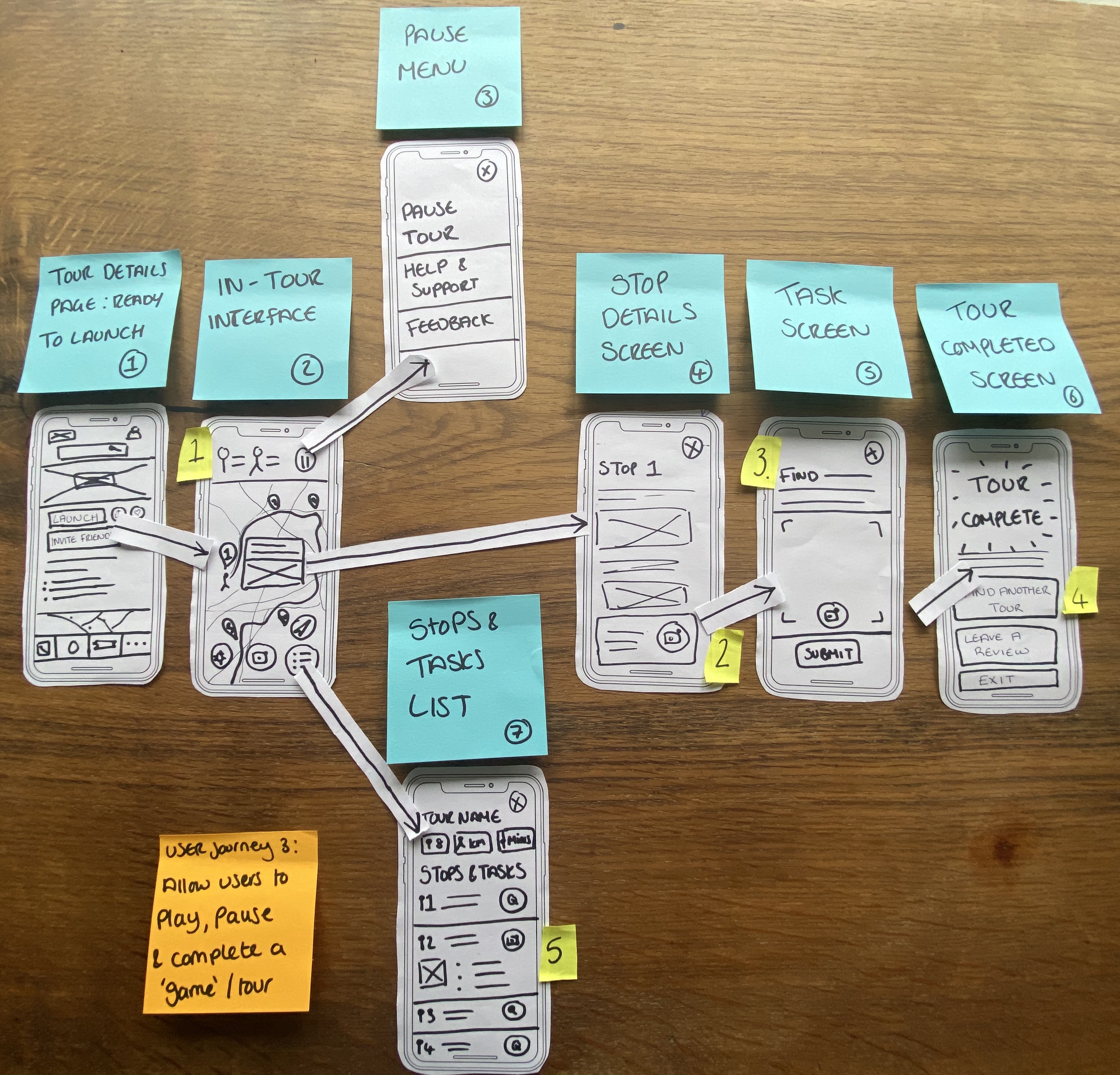
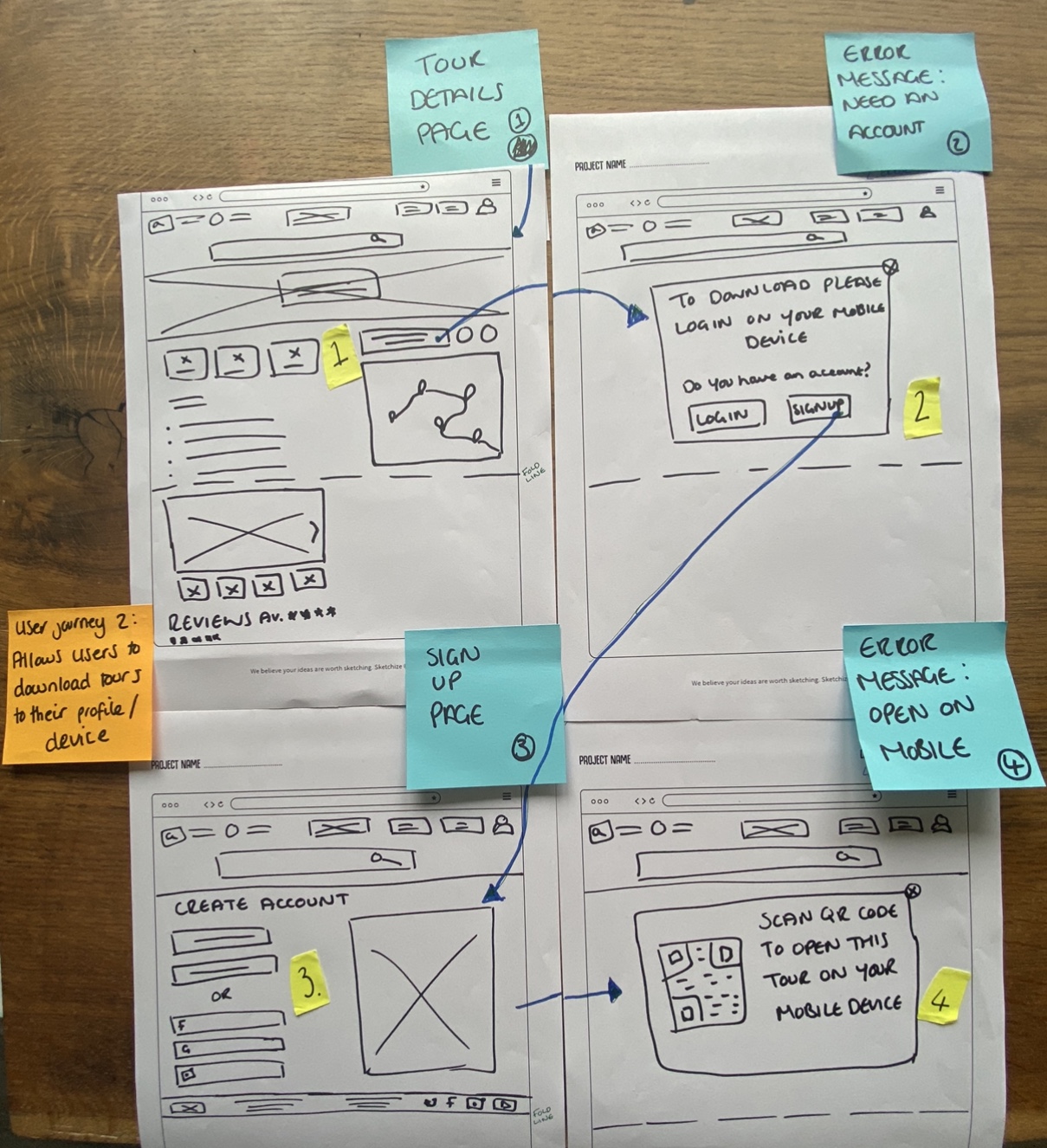
The initial designs, based on the user flows, were sketched out on paper to allow for multiple rounds of quick iteration that were done in collaboration with peers and industry mentors.
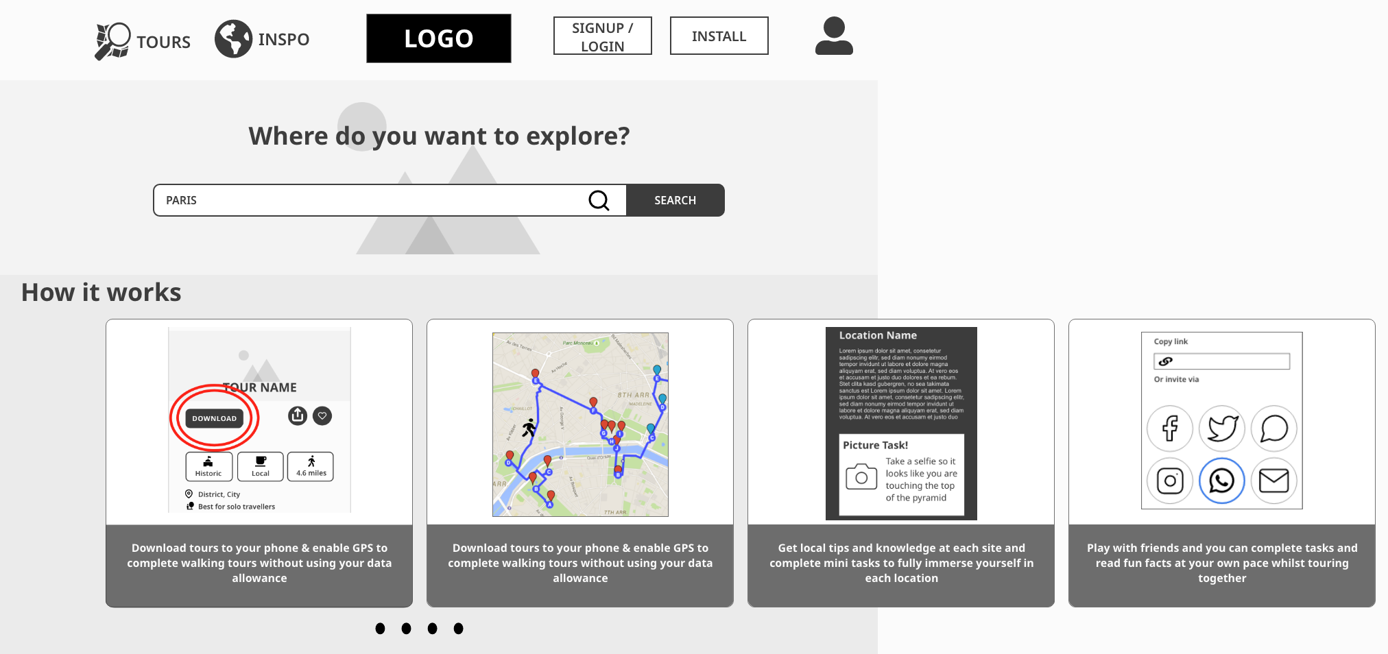
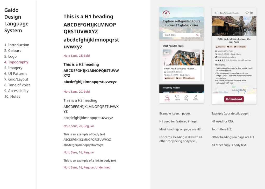
I decided to design in Adobe XD for the mid-fidelity wireframes as I had some prior experience with it and I liked that designing, prototyping and sharing could all happen in one software.


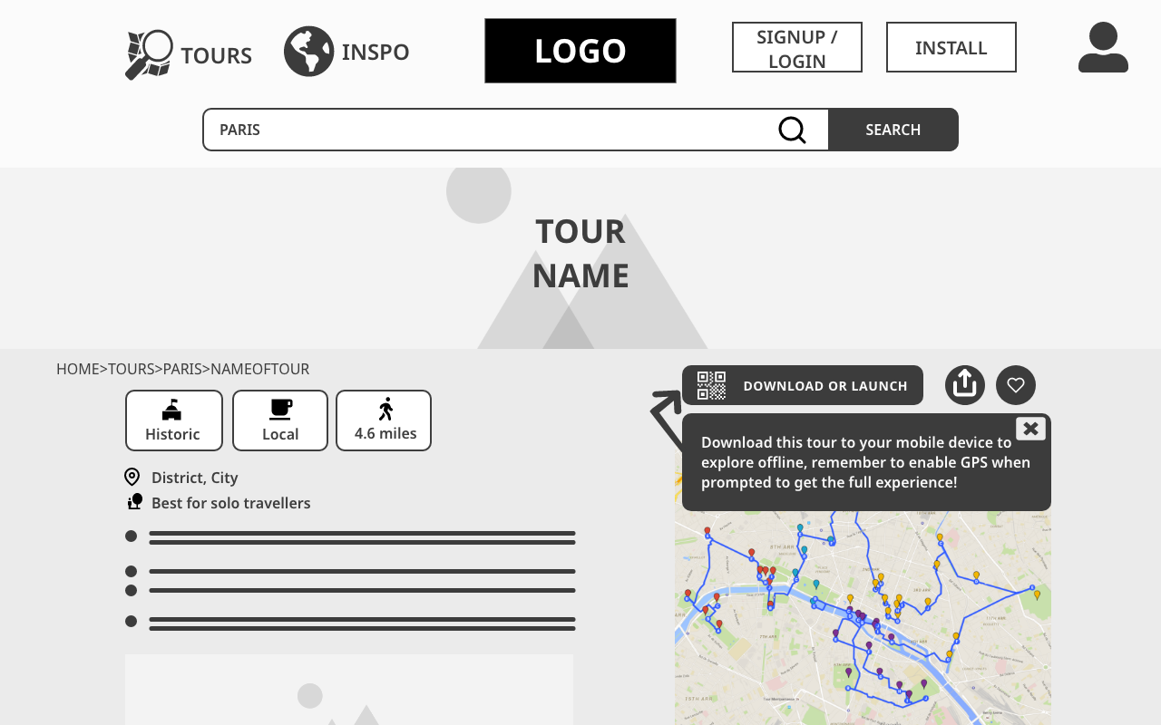
One of the challenges I faced was that this product needed to be a responsive web app and not a native app, as per the brief. With a native app, there are certain elements, such as onboarding, that have a very natural place in the user flow. However, with a web app, users could land in multiple places on the app through organic search. The main ways I tackled this problem were;
- Have an onboarding widget on the search page, where users are most likely to land, that can be easily dismissed by returning users
- Encourage users to save the app to their home screen, so it then functions more like a traditional app
- Design mobile-first as that is where I predict the majority of users to be, and the in-tour interface can only be accessed on a mobile device. Desktop users are guided to their mobile device when they get to that part of the flow
Below you can see early user flow sketches and mid-fidelity wireframes for desktop.

As soon as the main functionality was mapped out to mid-fidelity, I wanted to begin testing it with real users as quickly as possible so I could understand how people would approach the app and pick up on critical errors early.
I conducted a series of moderated in-person and remote tests, giving users various scenarios that matched the goals of the core user stories.
As well as completing tasks, I asked users questions such as “What do you think the purpose of this app is?” which flagged up a critical error that the signposting on the home page was not clear enough for users to understand the purpose of the app within the first few seconds of landing on it.

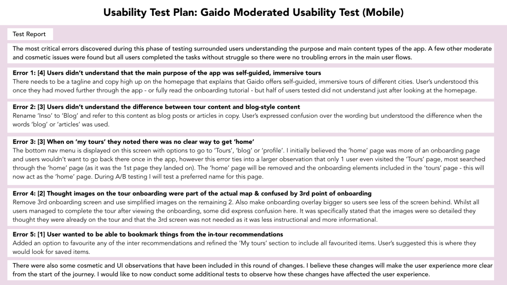
The 5 errors shown on the test report, plus some other minor UI recommendations, were all decided to be important enough to update during this iteration.
As Error 1 was the most critical, I prioritised this and updated the home page to include more direct copy referring to the app’s purpose. I then ran a 13-person, un-moderated test to assess whether the updated wireframes led to a rise in people understanding the purpose of the app within the first 5 seconds of viewing it. The results of this test were positive with 60% of respondents mentioning ‘tours’ or ‘self-guided’ in their answers.
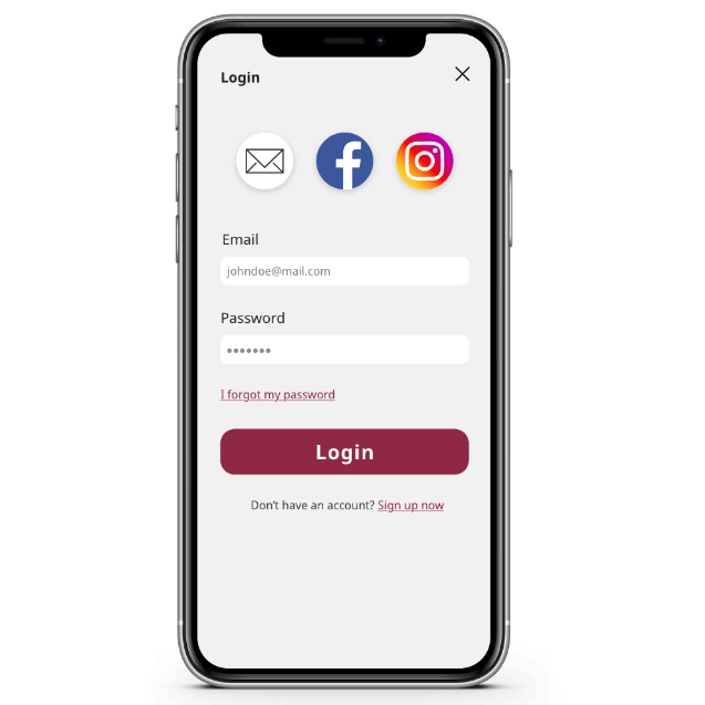
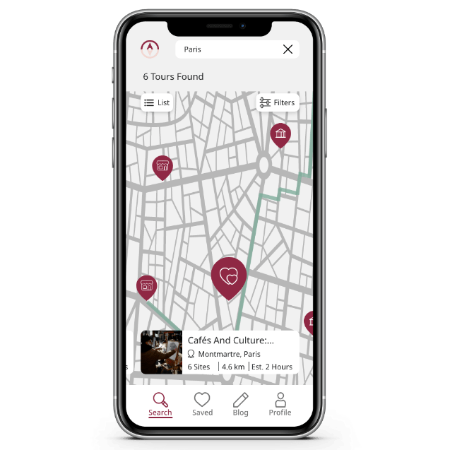
Below you will find a clickable prototype and a video walk-through of the finished mockups.
https://xd.adobe.com/view/08678c37-8328-4403-9565-ac795c3e83fc-5d34/?fullscreen


Implement

Once I was happy with the functionality and usability of the app it was time to take a step back and think about the branding and UI.
The word Gaido is a Japanese word meaning ‘guide’ or even more specifically ‘tour guide’. It perfectly captured how the app itself is your tour guide, no matter where in the world you are.
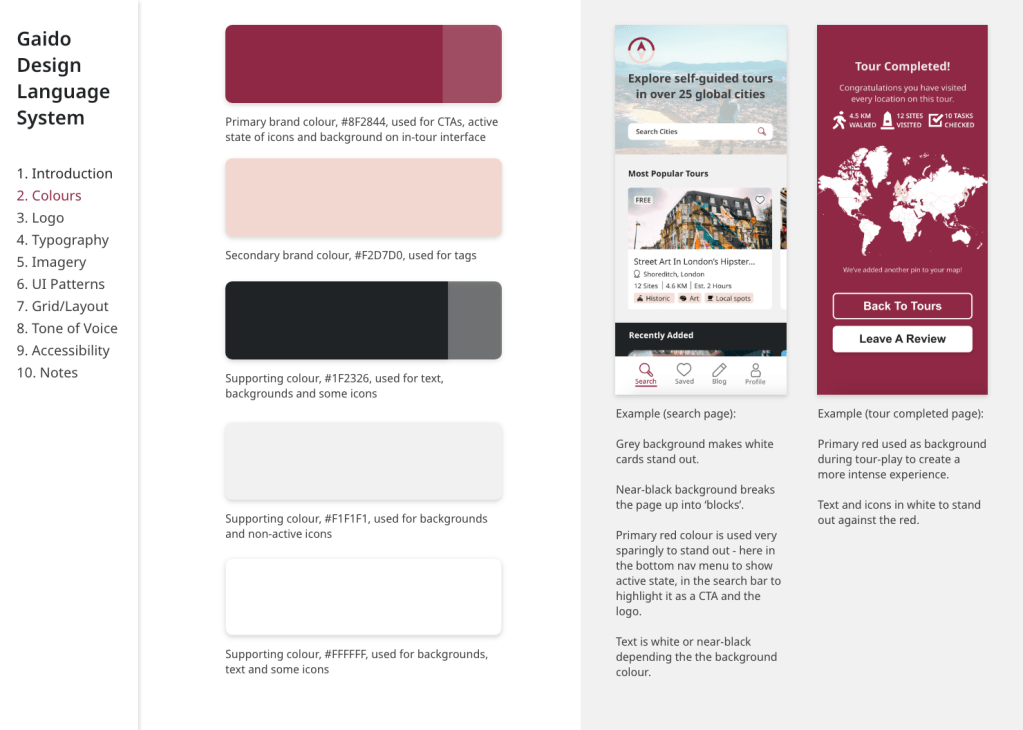
The main brand colours are inspired by the sakura (cherry blossom) season in Japan, with a dark, wine red that invokes a sense of stability; it borders on a plum purple and takes on some of those qualities of luxury and mystery. The supporting pink brings a sense of playfulness and innocent wonder. Luxury and stability are things people often look for when booking travel experiences, whilst anyone who wants to tour a city in this unique way will have to have a sense of wonder and play.
When designing the UI patterns there were 3 main things I kept in the forefront of my mind:
- Gestalt principles of design
- Accessibility, particularly when deciding colours, fonts and spacing
- Popular design systems that I am a fan of including AirBnB and Hostelworld
Even though this isn’t a live project that is going to be built, it was important for me to bring it to a full conclusion and get the assets to the point where they could be handed off to a dev team.
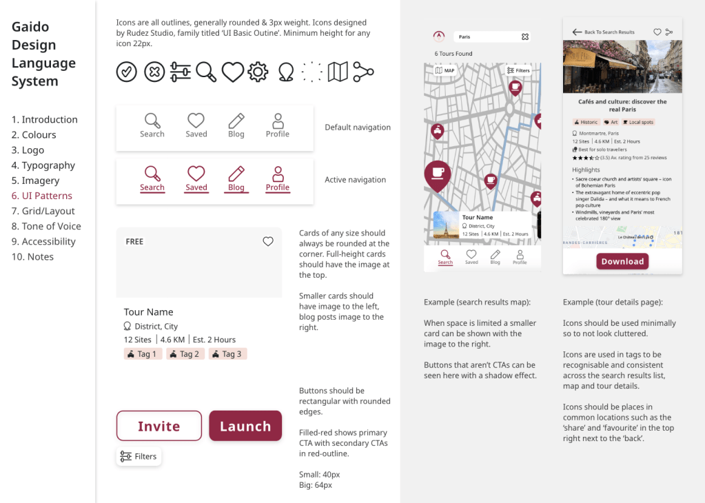
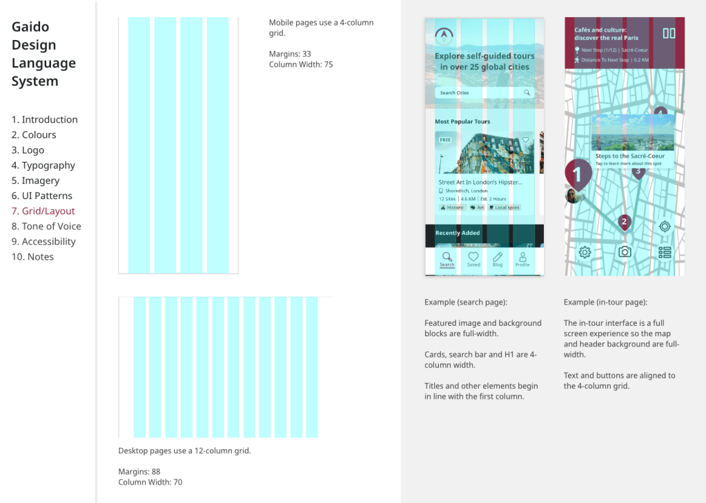
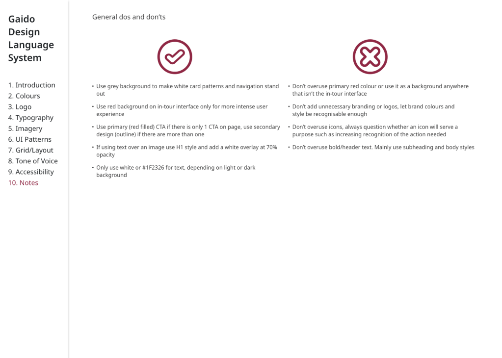
I created a design language system that cemented all of the design decisions made throughout the iteration process.


In a live project, my next steps would be to monitor the build and launch of this MVP and then begin working on gathering feedback and mapping out features for future releases.
I see great scope with this project to include technology, such as AR, to make the tours more immersive and this is something I would look into next.
Personal learnings
As this project was completed solo there was a huge learning curve as I had to cover product ownership, research, UX, UI, branding and content. I now have a much better understanding of my personal UX design process after completing this project end-to-end
I will take forward into my next project that valuable insights can be received from even 1 or 2 people looking over your work so seeking feedback outside of formal testing is important at every stage.
One particular challenge of this project was having such a huge vision for what the app could be. I learnt how to strip it down to the most important features for the user (not just the ones I most wanted to design) in order to create a valuable MVP.

Leave a comment